![]()
Model-Data Confrontation in the Spectral Domain#
In this notebook, we demonstrate the use of the spectral analysis features of Pyleoclim and reproduce the results of Zhu et al. (2019). The goal is to perform comparison of the climate variability across scales simulated by climate models and observed in proxy records.
Data Exploration#
Let’s start by importing the packages that we will need:
import pandas as pd
import numpy as np
import xarray as xr
import pyleoclim as pyleo
pyleo.set_style('web')  # set the visual style
PMIP3 last millennium simulations#
The PMIP3 (Braconnot et al. 2012) simulations of the past millennium (past1000) of global mean surface temperature (GMST) are stored in a text file and can be imported with Pandas conveniently.
# load the raw data
df = pd.read_table('./data/PMIP3_GMST.txt')

# display the raw data
df
| Year | bcc_csm1_1 | CCSM4 | FGOALS_gl | FGOALS_s2 | IPSL_CM5A_LR | MPI_ESM_P | CSIRO | GISS-E2-R_r1i1p121 | GISS-E2-R_r1i1p127 | ... | CESM_member_1 | CESM_member_2 | CESM_member_3 | CESM_member_4 | CESM_member_5 | CESM_member_6 | CESM_member_7 | CESM_member_8 | CESM_member_9 | CESM_member_10 | |
|---|---|---|---|---|---|---|---|---|---|---|---|---|---|---|---|---|---|---|---|---|---|
| 0 | 850 | -0.570693 | -0.431830 | NaN | -0.620995 | -0.475963 | -0.170230 | NaN | 0.116333 | 0.155407 | ... | 0.036672 | 0.067692 | 0.085340 | -0.000616 | 0.157021 | 0.048458 | 0.038173 | -0.027151 | 0.143404 | -0.053464 |
| 1 | 851 | -0.698903 | -0.411177 | NaN | -0.753160 | -0.742970 | -0.303124 | -0.398695 | 0.068174 | 0.210337 | ... | 0.246816 | 0.181400 | 0.251417 | 0.170710 | 0.165139 | 0.324856 | 0.191677 | 0.120951 | 0.216921 | 0.068698 |
| 2 | 852 | -0.575440 | -0.404802 | NaN | -0.743508 | -0.758939 | -0.422623 | -0.406343 | 0.060088 | 0.240585 | ... | 0.187429 | 0.065922 | 0.190229 | 0.264551 | 0.092629 | 0.386593 | 0.068904 | 0.292246 | 0.101564 | 0.200259 |
| 3 | 853 | -0.724757 | -0.552719 | NaN | -0.869331 | -0.746460 | -0.335177 | -0.353557 | -0.074396 | 0.030596 | ... | 0.202443 | 0.089054 | -0.031298 | 0.205805 | 0.049447 | 0.023312 | -0.041356 | 0.206064 | 0.212954 | 0.288272 |
| 4 | 854 | -0.724328 | -0.734938 | NaN | -0.826238 | -0.684093 | -0.650792 | -0.416140 | -0.402800 | -0.330589 | ... | 0.062795 | 0.137882 | -0.233049 | -0.227240 | -0.156577 | -0.339176 | -0.103825 | 0.058420 | -0.006102 | -0.006619 |
| ... | ... | ... | ... | ... | ... | ... | ... | ... | ... | ... | ... | ... | ... | ... | ... | ... | ... | ... | ... | ... | ... |
| 1161 | 2011 | 1.013544 | NaN | NaN | NaN | NaN | NaN | NaN | NaN | NaN | ... | NaN | NaN | NaN | NaN | NaN | NaN | NaN | NaN | NaN | NaN |
| 1162 | 2012 | NaN | NaN | NaN | NaN | NaN | NaN | NaN | NaN | NaN | ... | NaN | NaN | NaN | NaN | NaN | NaN | NaN | NaN | NaN | NaN |
| 1163 | 2013 | NaN | NaN | NaN | NaN | NaN | NaN | NaN | NaN | NaN | ... | NaN | NaN | NaN | NaN | NaN | NaN | NaN | NaN | NaN | NaN |
| 1164 | 2014 | NaN | NaN | NaN | NaN | NaN | NaN | NaN | NaN | NaN | ... | NaN | NaN | NaN | NaN | NaN | NaN | NaN | NaN | NaN | NaN |
| 1165 | 2015 | NaN | NaN | NaN | NaN | NaN | NaN | NaN | NaN | NaN | ... | NaN | NaN | NaN | NaN | NaN | NaN | NaN | NaN | NaN | NaN |
1166 rows × 22 columns
The file includes several ensemble members for CESM and GISS simulations, for which we substitue their ensemble mean series.
# create a new pandas.DataFrame to store the processed data
df_new = df.copy()

# remove the data columns for CESM and GISS ensemble members
for i in range(10):
    df_new = df_new.drop([f'CESM_member_{i+1}'], axis=1)

df_new = df_new.drop(['GISS-E2-R_r1i1p127.1'], axis=1)
df_new = df_new.drop(['GISS-E2-R_r1i1p127'], axis=1)
df_new = df_new.drop(['GISS-E2-R_r1i1p121'], axis=1)

# calculate the ensemble mean for CESM and GISS, and add the results into the table
df_new['CESM'] = df[[f'CESM_member_{i+1}' for i in range(10)]].mean(axis=1)

df_new['GISS'] = df[[
    'GISS-E2-R_r1i1p127.1',
    'GISS-E2-R_r1i1p127',
    'GISS-E2-R_r1i1p121',
]].mean(axis=1)

# display the processed data
df_new
| Year | bcc_csm1_1 | CCSM4 | FGOALS_gl | FGOALS_s2 | IPSL_CM5A_LR | MPI_ESM_P | CSIRO | HadCM3 | CESM | GISS | |
|---|---|---|---|---|---|---|---|---|---|---|---|
| 0 | 850 | -0.570693 | -0.431830 | NaN | -0.620995 | -0.475963 | -0.170230 | NaN | -0.620517 | 0.049553 | 0.127429 |
| 1 | 851 | -0.698903 | -0.411177 | NaN | -0.753160 | -0.742970 | -0.303124 | -0.398695 | -0.553043 | 0.193858 | 0.138796 |
| 2 | 852 | -0.575440 | -0.404802 | NaN | -0.743508 | -0.758939 | -0.422623 | -0.406343 | -0.560791 | 0.185033 | 0.098170 |
| 3 | 853 | -0.724757 | -0.552719 | NaN | -0.869331 | -0.746460 | -0.335177 | -0.353557 | -0.438949 | 0.120470 | -0.054552 |
| 4 | 854 | -0.724328 | -0.734938 | NaN | -0.826238 | -0.684093 | -0.650792 | -0.416140 | -0.812194 | -0.081349 | -0.407169 |
| ... | ... | ... | ... | ... | ... | ... | ... | ... | ... | ... | ... |
| 1161 | 2011 | 1.013544 | NaN | NaN | NaN | NaN | NaN | NaN | NaN | NaN | NaN |
| 1162 | 2012 | NaN | NaN | NaN | NaN | NaN | NaN | NaN | NaN | NaN | NaN |
| 1163 | 2013 | NaN | NaN | NaN | NaN | NaN | NaN | NaN | NaN | NaN | NaN |
| 1164 | 2014 | NaN | NaN | NaN | NaN | NaN | NaN | NaN | NaN | NaN | NaN |
| 1165 | 2015 | NaN | NaN | NaN | NaN | NaN | NaN | NaN | NaN | NaN | NaN |
1166 rows × 11 columns
pyleoclim capabilities can now be leveraged.
We now define a pyleoclim.Series object for each simulated GMST time series.
A pyleoclim.Series represents a time series object that comes with a collection of methods, such as performing spectral analysis, wavelet analysis, interpolation, plotting, and so on.
For details, see the documentation.
# store each pyleoclim.Series() object into a dictionary
ts_dict = {}
for name in df_new.columns[1:]:
    ts_dict[name] = pyleo.Series(
        time=df_new['Year'].values,  # the time axis
        value=df_new[name].values,   # the value axis
        label=name,                  # optional metadata: the nickname of the series
        time_name='Time',            # optional metadata: the name of the time axis
        time_unit='yrs',             # optional metadata: the unit of the time axis
        value_name='GMST anom.',     # optional metadata: the name of the value axis
        value_unit='K',              # optional metadata: the unit of the value axis
        verbose = False,             # suppresses warnings
    )
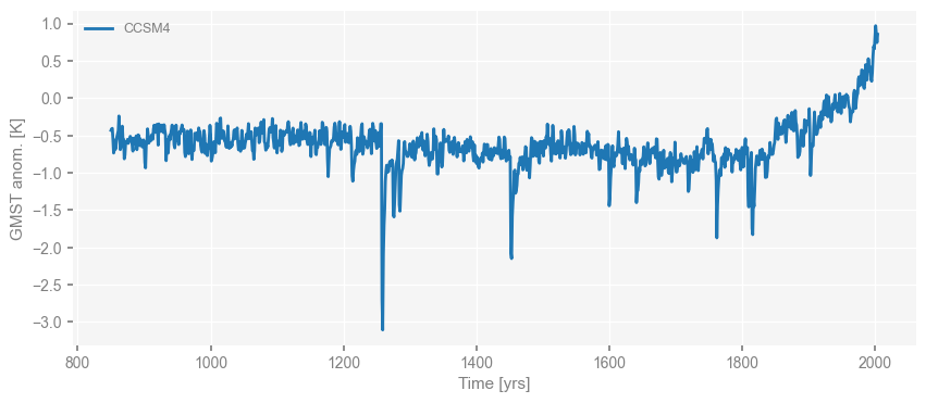
Once a pyleoclim.Series is defined, we can easily visualize it by calling the pyleoclim.Series.plot() method.
For instance, we plot the CCSM4 GMST below:
fig, ax = ts_dict['CCSM4'].plot()
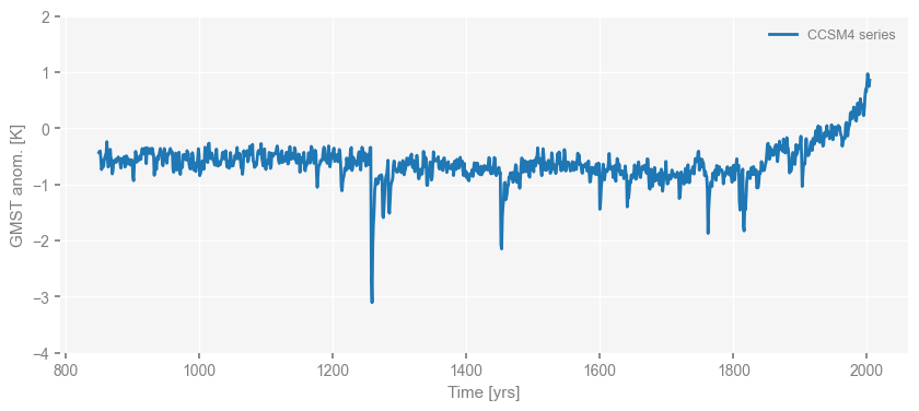
Note that the return of the plot() method is a list of a matplotlib.pyplot.figure and a matplotlib.pyplot.axis.
That means all possible matplotlib manipulations can follow.
For instance, let’s change the limit of the y-axis and the label below.
fig, ax = ts_dict['CCSM4'].plot(label='CCSM4 series')
ax.set_ylim([-4, 2])
(-4.0, 2.0)
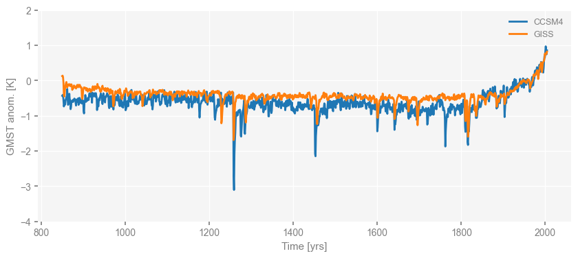
With the same mechanism, we may plot two time series in the same figure as following, in which we use the argument ax=ax to specify that the we’d like to plot the series of GISS into the same matplotlib.pyplot.axis.
fig, ax = ts_dict['CCSM4'].plot()
ts_dict['GISS'].plot(ax=ax)  # the argument "ax=ax" indicates we'd like to plot into the "ax" we got from the previous line of code
ax.set_ylim([-4, 2])
(-4.0, 2.0)
To plot a collection of time series at once, we define a pyleoclim.MultipleSeries object, which takes a list of pyleoclim.Series objects as input.
Since we have defined a dictionary of a collection of pyleoclim.Series objects, we may first convert this dictionary into a list, and then use that list to define a pyleoclim.MultipleSeries object.
ts_list = [v for k, v in ts_dict.items()]  # a pythonic way to convert the pyleo.Series items in the dictionary to a list
ms_pmip = pyleo.MultipleSeries(ts_list)
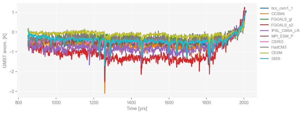
Now that the pyleoclim.MultipleSeries called “ms_pmip” is defined, we can visualize all the time series at once by calling the pyleoclim.MultipleSeries.plot() method.
fig, ax = ms_pmip.plot()
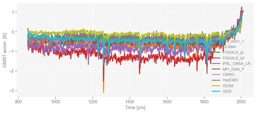
You may notice that the legend is not in its best place, and we may want to move it to the right side.
We can achieve that by passing a dictionary of arguments for matplotlib.pyplot.axis.legend() (see the matplotlib documentation for details) as below:
fig, ax = ms_pmip.plot(lgd_kwargs={'bbox_to_anchor': (1, 1)}) # move the legend to the right side
Now that the loading of PMIP3 simulations is complete, let’s move on to proxies, the last millennium reanalysis (LMR, Hakim et al. 2016; Tardif et al. 2019), and deglacial simulations.
Proxies, LMR, and deglacial simulations#
We’ve preprocessed the data for proxies, LMR (Hakim et al., 2016; Tardif et al., 2019), and deglacial simulations, and stored them in a NetCDF file.
ds = xr.open_dataset('./data/PNAS19_data.nc')
ds
<xarray.Dataset> Size: 5MB
Dimensions:         (time: 48845)
Coordinates:
  * time            (time) float64 391kB -4.998e+06 -4.993e+06 ... 2.018e+03
Data variables:
    EDC             (time) float64 391kB ...
    HadCRUT4        (time) float64 391kB ...
    GAST            (time) float64 391kB ...
    ProbStack       (time) float64 391kB ...
    LMR             (time) float64 391kB ...
    trace21ka_full  (time) float64 391kB ...
    trace21ka_mwf   (time) float64 391kB ...
    trace21ka_orb   (time) float64 391kB ...
    trace21ka_ghg   (time) float64 391kB ...
    trace21ka_ice   (time) float64 391kB ...
    DGns            (time) float64 391kB ...
SIM2bl (time) float64 391kB ...Next, we create two dictionaries called ts and vs to store the data extracted from the NetCDF file.
ts includes the time axis for each dataset,
and vs includes the GMST for each dataset.
We may print out the dictionary keys to see how many datasets we have.
ts, vs = {}, {}

for name in ds.variables:
    if name != 'time':
        ts[name] = ds[name].time
        vs[name] = ds[name].values

print(vs.keys())
dict_keys(['EDC', 'HadCRUT4', 'GAST', 'ProbStack', 'LMR', 'trace21ka_full', 'trace21ka_mwf', 'trace21ka_orb', 'trace21ka_ghg', 'trace21ka_ice', 'DGns', 'SIM2bl'])
As before, we extract the data and organize them in Series objects:
for name in vs.keys():
    # we may specify specific metadata for each dataset with the if-clauses
    if name == 'LMR':
        value_name = 'GSMT anom.'
        value_unit = 'K'
    elif name in ['trace21ka_full', 'DGns', 'SIM2bl']:
        value_name = 'GSMT'
        value_unit = 'K'
    else:
        value_name = 'Proxy Value'
        value_unit = None

    if name == 'trace21ka_full':
        label = 'TraCE-21ka'
    elif name in ['trace21ka_mwf', 'trace21ka_orb', 'trace21ka_ghg', 'trace21ka_ice']:
        continue
    else:
        label = name

    ts_dict[name] = pyleo.Series(
        time=ts[name],
        value=vs[name],
        label=label,
        time_name='Time',
        time_unit='yrs',
        value_name=value_name,
        value_unit=value_unit,
        verbose = False,
    )
Now we define a MultipleSeries object for each group of datasets:
ms_obs = pyleo.MultipleSeries(
    [ts_dict[name] for name in ['EDC', 'HadCRUT4', 'GAST', 'ProbStack']]
)
ms_deglacial = pyleo.MultipleSeries(
    [ts_dict[name] for name in ['trace21ka_full', 'DGns', 'SIM2bl']]
)
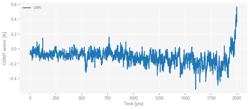
Now we visualize what we have. LMR first.
Note that here we use the median of the LMR ensembles for our analysis for simplicity and calculation speed, while all the ensemble members are being analyzed in the original paper, so the estimated scaling slope value that we show later would be a bit different from that in the original paper.
fig, ax = ts_dict['LMR'].plot()
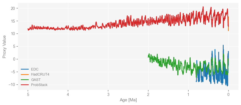
Then the proxies.
fig, ax = ms_obs.plot()
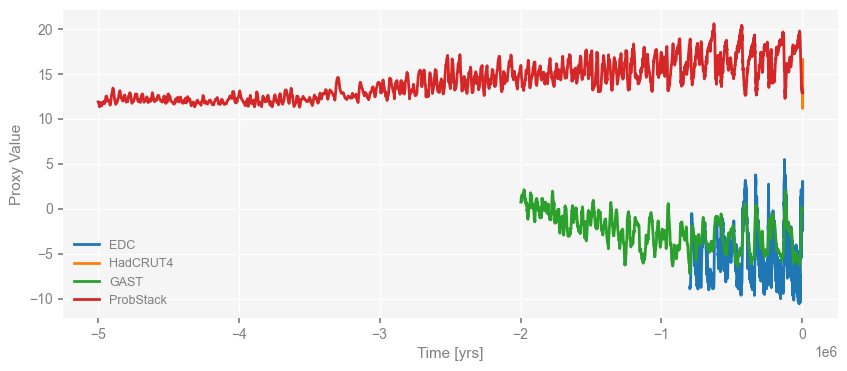
We notice that the time axis is in unit of years by default, which is odd for paleo-records prior to CE.
We can easily convert the time unit to “kyrs BP” by calling the pyleoclim.MultipleSeries.convert_time_unit method as below:
ms_obs = ms_obs.convert_time_unit('ma')
fig, ax = ms_obs.plot()
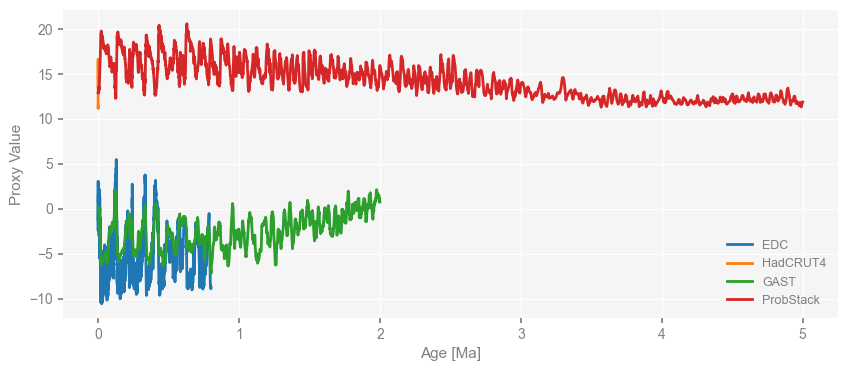
Now the time unit is “myrs BP”, and the numerical time values are ascending.
What if we wanted to present the data in a way that the right hand side represents more recent time? We can manipulate the returned matplotlib.pyplot.axis object as mentioned earlier, or just use the invert_xaxis=True argument of the pyleoclim.MultipleSeries.plot() method as below:
fig, ax = ms_obs.plot(invert_xaxis=True)
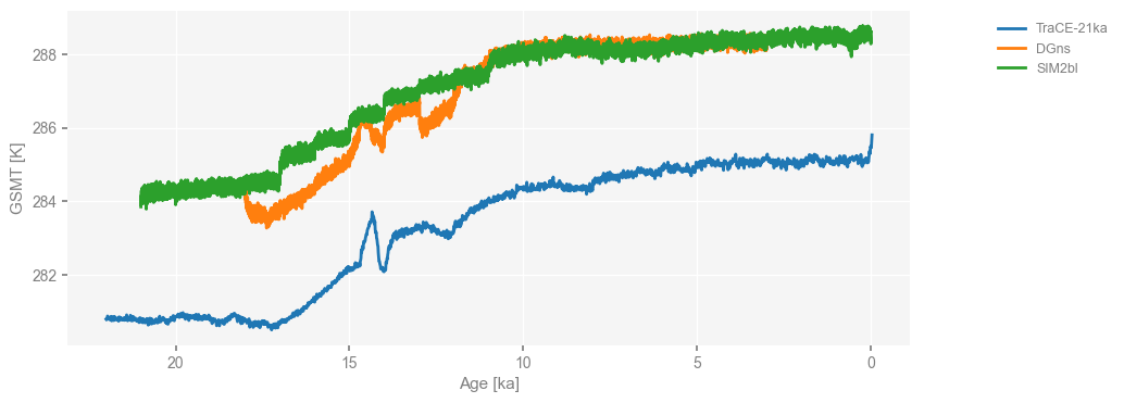
Similarly, we convert the time unit of deglacial simulations to “kyrs BP” and then visualize them with the x-axis inverted and the lelgend location moved to the right side.
ms_deglacial = ms_deglacial.convert_time_unit('kyrs BP')
fig, ax = ms_deglacial.plot(
    lgd_kwargs={
        'loc': 'upper right',         # put the legend anchor to the upper right corner
        'bbox_to_anchor': (1.25, 1),  # move the legend to the right side
    },
    invert_xaxis=True,
)
Now that all data needed has been loaded, let’s perform spectral analysis using the Weighted Wavelet Z-transform method (WWZ, Foster 1996; Kirchner & Neal 2013), which can handle unevenly-spaced data without interpolation.
Spectral analysis#
A WWZ perspective#
We may perform spectral analysis on time series by calling the pyleoclim.Series.spectral() method.
It has the argument method to specify which method to use. It is set to wwz by default to use the WWZ method.
It also has an argument freq_method to specify the approach to generate the frequency vector for the analysis.
It is set to log by default to use generate the frequency vector in a log space.
Here, we set to nfft so that we can reproduce the result in the original paper Zhu et al. (2019).
Other arguments specific to each spectral analysis method can be passed in through the argument settings.
Since WWZ is originally a wavelet analysis method, we may specify tau to specify the evenly-spaced time points (the temporal resolution) for wavelet analysis.
However, since our purpose here is spectral analysis, the temporal resolution is not required to be high, and we may use small values to accelerate the calculation.
Please see the documentation on pyleoclim.Series.spectral and the wwz_psd function that pyeloclim.Series.spectral called for details.
The method will return a pyleoclim.PSD object, which includes the estimated power spectral density (PSD) along with the information of the frequency axis, and the object iteself is intended for lalter operations such as visualization, scaling slope estimation, and significance test.
Note that to reproduce exactly the result in the paper, we need to use settings in the cell below (that’s commented out), which could be slow (> 5 mins). For the sake of time, we may load a file with pre-calculated results.
%%time

psd_wwz = {}
for name, ts in ts_dict.items():
    print(f'Processing {name} ...')
    print(f'Data length: {np.size(ts.time)}')
    if name in ['DGns', 'SIM2bl']:
        ntau = 51  # to accelerate the calculation; the smaller, the faster
    else:
        ntau = 501
    tau = np.linspace(np.min(ts.time), np.max(ts.time), ntau)
    psd_wwz[name] = ts.spectral(method='wwz', freq='nfft', settings={'tau': tau, 'standardize':False})
Processing bcc_csm1_1 ...
Data length: 1162
Processing CCSM4 ...
Data length: 1155
Processing FGOALS_gl ...
Data length: 999
Processing FGOALS_s2 ...
Data length: 1155
Processing IPSL_CM5A_LR ...
Data length: 1155
Processing MPI_ESM_P ...
Data length: 1155
Processing CSIRO ...
Data length: 1150
Processing HadCM3 ...
Data length: 1151
Processing CESM ...
Data length: 1155
Processing GISS ...
Data length: 1155
Processing EDC ...
Data length: 5785
Processing HadCRUT4 ...
Data length: 2015
Processing GAST ...
Data length: 2000
Processing ProbStack ...
Data length: 2051
Processing LMR ...
Data length: 2001
Processing trace21ka_full ...
Data length: 2204
Processing DGns ...
Data length: 15000
Processing SIM2bl ...
Data length: 21000
CPU times: user 19min 51s, sys: 1min 27s, total: 21min 19s
Wall time: 2min 39s
# we will store the result in a NetCDF file with the dataset names as variable names
import xarray as xr
da = {}
for name, psd in psd_wwz.items():
    da[name] = xr.DataArray(psd.amplitude, coords={f'freq_{name}': psd.frequency})

ds = xr.Dataset(da)
ds.to_netcdf('./data/PNAS19_psd.nc')
# quick loading of the pre-calculated data
ds = xr.open_dataset('./data/PNAS19_psd.nc')
ds
<xarray.Dataset> Size: 507kB
Dimensions:              (freq_bcc_csm1_1: 580, freq_CCSM4: 577,
                          freq_FGOALS_gl: 499, freq_FGOALS_s2: 577,
                          freq_IPSL_CM5A_LR: 577, freq_MPI_ESM_P: 577,
                          freq_CSIRO: 574, freq_HadCM3: 575, freq_CESM: 577,
                          freq_GISS: 577, freq_EDC: 2892, freq_HadCRUT4: 1007,
                          freq_GAST: 999, freq_ProbStack: 1025, freq_LMR: 1000,
                          freq_trace21ka_full: 1101, freq_DGns: 7499,
                          freq_SIM2bl: 10499)
Coordinates: (12/18)
  * freq_bcc_csm1_1      (freq_bcc_csm1_1) float64 5kB 0.001721 0.002582 ... 0.5
  * freq_CCSM4           (freq_CCSM4) float64 5kB 0.0008666 0.001733 ... 0.5
  * freq_FGOALS_gl       (freq_FGOALS_gl) float64 4kB 0.001002 0.002004 ... 0.5
  * freq_FGOALS_s2       (freq_FGOALS_s2) float64 5kB 0.0008666 0.001733 ... 0.5
  * freq_IPSL_CM5A_LR    (freq_IPSL_CM5A_LR) float64 5kB 0.0008666 ... 0.5
  * freq_MPI_ESM_P       (freq_MPI_ESM_P) float64 5kB 0.0008666 0.001733 ... 0.5
    ...                   ...
  * freq_GAST            (freq_GAST) float64 8kB 1e-06 1.5e-06 ... 0.0005
  * freq_ProbStack       (freq_ProbStack) float64 8kB 2.439e-07 ... 0.00025
  * freq_LMR             (freq_LMR) float64 8kB 0.0005 0.001 ... 0.4995 0.5
  * freq_trace21ka_full  (freq_trace21ka_full) float64 9kB 9.074e-05 ... 0.05
  * freq_DGns            (freq_DGns) float64 60kB 0.0001333 0.0002 ... 0.5
  * freq_SIM2bl          (freq_SIM2bl) float64 84kB 9.524e-05 0.0001429 ... 0.5
Data variables: (12/18)
    bcc_csm1_1           (freq_bcc_csm1_1) float64 5kB ...
    CCSM4                (freq_CCSM4) float64 5kB ...
    FGOALS_gl            (freq_FGOALS_gl) float64 4kB ...
    FGOALS_s2            (freq_FGOALS_s2) float64 5kB ...
    IPSL_CM5A_LR         (freq_IPSL_CM5A_LR) float64 5kB ...
    MPI_ESM_P            (freq_MPI_ESM_P) float64 5kB ...
    ...                   ...
    GAST                 (freq_GAST) float64 8kB ...
    ProbStack            (freq_ProbStack) float64 8kB ...
    LMR                  (freq_LMR) float64 8kB ...
    trace21ka_full       (freq_trace21ka_full) float64 9kB ...
    DGns                 (freq_DGns) float64 60kB ...
SIM2bl (freq_SIM2bl) float64 84kB ...import pyleoclim as pyleo
# quick creation of the pyleoclim.PSD objects
psd_wwz = {}
for name in ds.variables:
if 'freq' not in name:
psd_wwz[name] = pyleo.PSD(
frequency=ds[name][f'freq_{name}'],
amplitude=ds[name].values,
label=name,
)
We may, however, perform the WWZ method with the default settings for the frequency vector that makes the calculation faster, and compare with the pre-calculated results. Note that the series will be standardized by default, but we don’t want to do it here since we’d like to piece together each PSD curve in the same figure to investigate the scaling behavior.
%%time
psd_wwz_new = {}
for name, ts in ts_dict.items():
    print(f'Processing {name} ...')
    print(f'Data length: {np.size(ts.time)}')
    psd_wwz_new[name] = ts.spectral(method='wwz', settings={'standardize': False})
Processing bcc_csm1_1 ...
Data length: 1162
Processing CCSM4 ...
Data length: 1155
Processing FGOALS_gl ...
Data length: 999
Processing FGOALS_s2 ...
Data length: 1155
Processing IPSL_CM5A_LR ...
Data length: 1155
Processing MPI_ESM_P ...
Data length: 1155
Processing CSIRO ...
Data length: 1150
Processing HadCM3 ...
Data length: 1151
Processing CESM ...
Data length: 1155
Processing GISS ...
Data length: 1155
Processing EDC ...
Data length: 5785
Processing HadCRUT4 ...
Data length: 2015
Processing GAST ...
Data length: 2000
Processing ProbStack ...
Data length: 2051
Processing LMR ...
Data length: 2001
Processing trace21ka_full ...
Data length: 2204
Processing DGns ...
Data length: 15000
Processing SIM2bl ...
Data length: 21000
CPU times: user 3min 15s, sys: 24.2 s, total: 3min 39s
Wall time: 1min 1s
Now we compare the results.
import matplotlib.pyplot as plt
for k in psd_wwz_new.keys():
    fig, ax = psd_wwz_new[k].plot(figsize=[8, 3], label='default settings')
    psd_wwz[k].plot(ax=ax, label='Zhu et al. [2019]', color='red', alpha=1)
    ax.set_title(k)
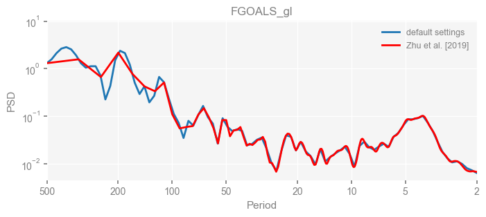
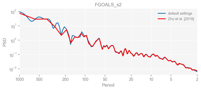
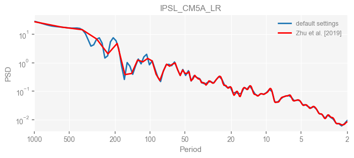
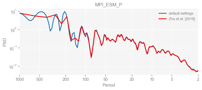
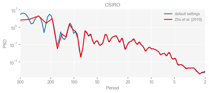
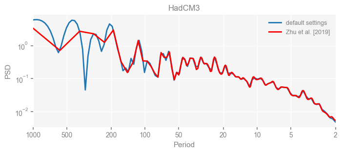
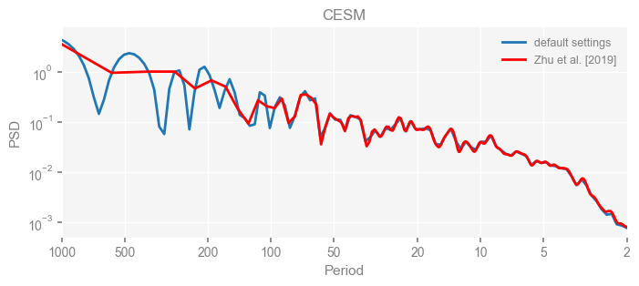
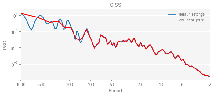
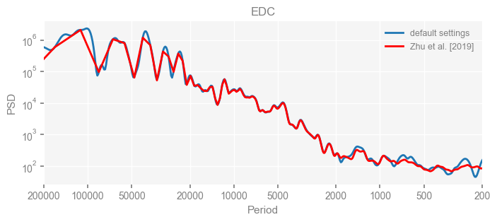
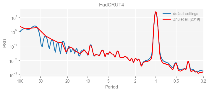
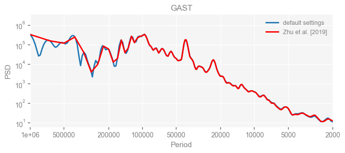
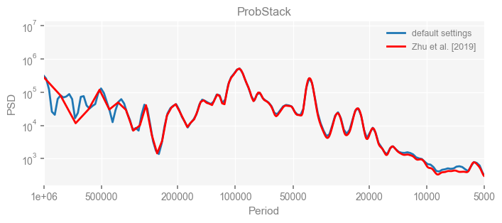
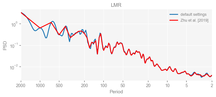
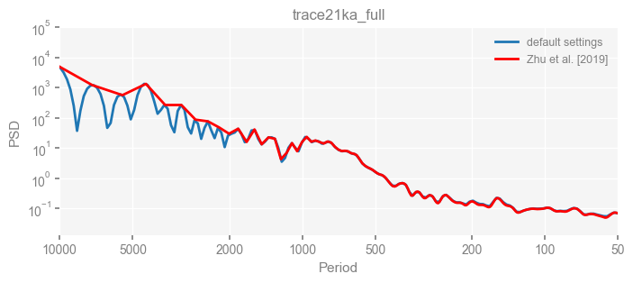
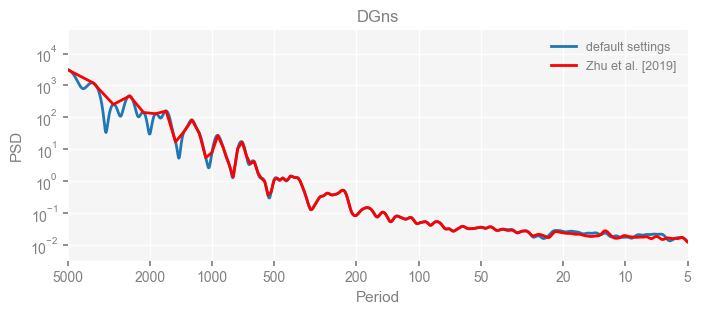
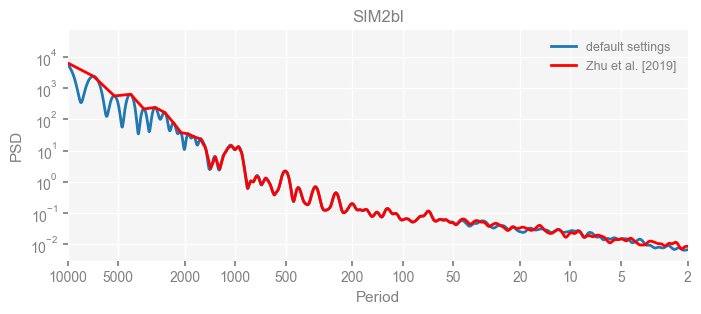
We see that the difference is overall rather small. Indeed, the difference is mainly caused by the frequency vector: the results of the paper used a linear spaced frequency vector while the current default settings used a log space vector. For the following presentation, we will stick with the pre-calculated results of the paper.
Visualization of the PSDs#
Now let’s visualize the results.
In below cells, we first define a colormap, then specify the colors for each pyleoclim.PSD object.
Similar to pyleoclim.MultipleSeries, we may also define a pyleoclim.MultiplePSD object for a collection of the pyleoclim.PSD objects for operations at once.
# define the tableau20 colors
tableau20 = [(31, 119, 180), (174, 199, 232), (255, 127, 14), (255, 187, 120),
             (44, 160, 44), (152, 223, 138), (214, 39, 40), (255, 152, 150),
             (148, 103, 189), (197, 176, 213), (140, 86, 75), (196, 156, 148),
             (227, 119, 194), (247, 182, 210), (127, 127, 127), (199, 199, 199),
             (188, 189, 34), (219, 219, 141), (23, 190, 207), (158, 218, 229)]

# scale the RGB values to the [0, 1] range, which is the format matplotlib accepts.
for i in range(len(tableau20)):
    r, g, b = tableau20[i]
    tableau20[i] = (r / 255., g / 255., b / 255.)
# define a dictionary for the colors
clr_dict = {
    'EDC': tableau20[0],
    'HadCRUT4': tableau20[3],
    'GAST': tableau20[4],
    'ProbStack': tableau20[5],
    'LMR': tableau20[6],
}

# specify color for each pyleoclim.PSD objects
for k, v in clr_dict.items():
    psd_wwz[k].plot_kwargs = {'color': v}

# for the period axis customization later
period_ticks = [0.5, 1, 2, 5, 10, 20, 100, 1e3, 1e4, 1e5, 1e6]
period_ticklabels = ['0.5', '1', '2', '5', '10', '20', '100', '1 k', '10 k', '100 k', '1 m']

# define the pyleoclim.MultiplePSD object and visualize the several pyleoclim.PSD objects at once
mpsd_obs = pyleo.MultiplePSD([psd_wwz[name] for name in ['EDC', 'HadCRUT4', 'GAST', 'ProbStack', 'LMR']])
fig, ax = mpsd_obs.plot(figsize=[8, 4])
ax.set_xlim([1e7, 0.1])
ax.set_ylim([1e-4, 1e8])
ax.set_xticks(period_ticks)
ax.set_xticklabels(period_ticklabels)
ax.set_ylabel('Spectral Density')
fig.savefig('./figs/pnas19_fig1.png', dpi=300, bbox_inches='tight', facecolor='white')
# pyleo.savefig(fig, './figs/pnas19_fig1.pdf')
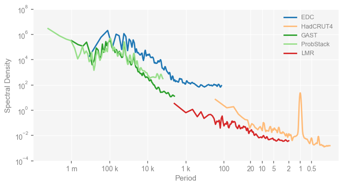
We have reproduced Fig. 1 of the original paper above.
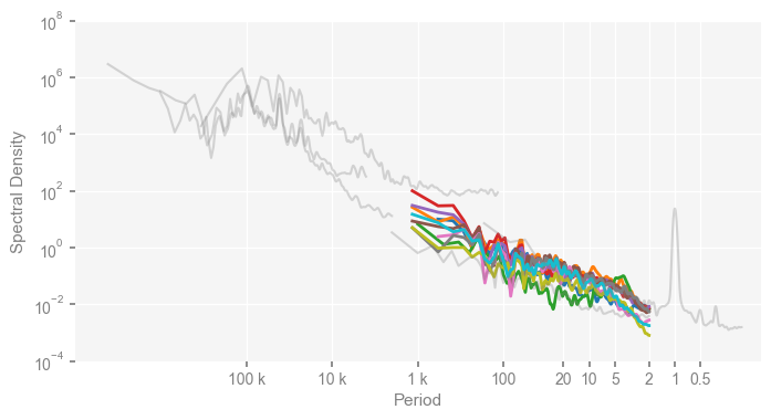
To reproduce the upper panel of Fig. 2, we reset the colors for observations to be grey, and set the opacity via alpha, as well as the line width via linewidth below.
Note that the colors for the PMIP3 simulations will follow a default list of Python.
clr_dict = {
    'EDC': 'grey',
    'HadCRUT4': 'grey',
    'GAST': 'grey',
    'ProbStack': 'grey',
    'LMR': 'grey'
}
for k, v in clr_dict.items():
    psd_wwz[k].plot_kwargs = {'color': v, 'alpha': 0.3, 'linewidth': 1.5}

mpsd_obs = pyleo.MultiplePSD([psd_wwz[name] for name in ['EDC', 'HadCRUT4', 'GAST', 'ProbStack', 'LMR']])

period_ticks = [0.5, 1, 2, 5, 10, 20, 100, 1000, 10000, 100000]
period_ticklabels = ['0.5', '1', '2', '5', '10', '20', '100', '1 k', '10 k', '100 k']

pmip_names = ['bcc_csm1_1', 'CCSM4', 'FGOALS_gl', 'FGOALS_s2', 'IPSL_CM5A_LR', 'MPI_ESM_P', 'CSIRO', 'HadCM3', 'CESM', 'GISS']

mpsd_pmip = pyleo.MultiplePSD([psd_wwz[name] for name in pmip_names])
fig, ax = mpsd_pmip.plot(figsize=[8, 4], cmap='tab10', lgd_kwargs={'bbox_to_anchor': (1, 1)})
mpsd_obs.plot(ax=ax, legend=False)
ax.set_xlim([1e7, 0.1])
ax.set_ylim([1e-4, 1e8])
ax.set_xticks(period_ticks)
ax.set_xticklabels(period_ticklabels)
ax.set_ylabel('Spectral Density')
Text(0, 0.5, 'Spectral Density')
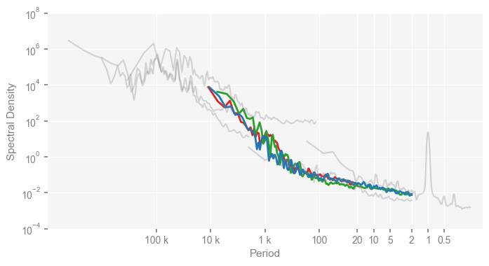
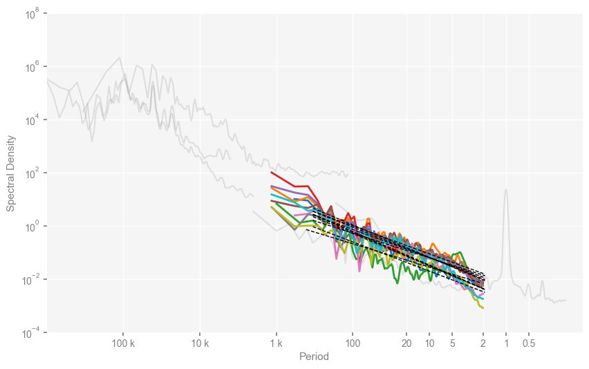
Similarly, we reproduce the lower panel of Fig. 2 of the original paper as below:
clr_deglacial_dict = {
    'trace21ka_full': tableau20[6],
    'DGns': tableau20[4],
    'SIM2bl': tableau20[0],
}
for k, v in clr_deglacial_dict.items():
    psd_wwz[k].plot_kwargs = {'color': v}


period_ticks = [0.5, 1, 2, 5, 10, 20, 100, 1000, 10000, 100000]
period_ticklabels = ['0.5', '1', '2', '5', '10', '20', '100', '1 k', '10 k', '100 k']

mpsd_deglacial = pyleo.MultiplePSD([psd_wwz[name] for name in ['trace21ka_full', 'DGns', 'SIM2bl']])
fig, ax = mpsd_deglacial.plot(figsize=[8, 4])
mpsd_obs.plot(ax=ax, legend=False)
ax.set_xlim([1e7, 0.1])
ax.set_ylim([1e-4, 1e8])
ax.set_xticks(period_ticks)
ax.set_xticklabels(period_ticklabels)
ax.set_ylabel('Spectral Density')
Text(0, 0.5, 'Spectral Density')
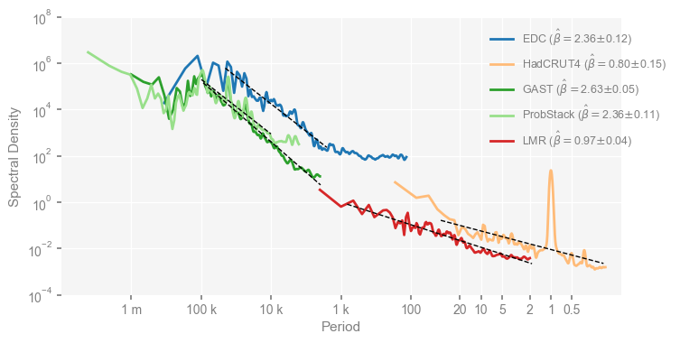
Estimation of the scaling exponents#
You may notice that something is missing comparing our reproduced figures to the figures in the original paper – the scaling exponents.
Below, we use the pyleoclim.PSD.beta_est() method to estimate the scaling exponents for each dataset.
To do that, we need to specify the frequency range over which we estimate.
The estimation is achieved utilizing linear regression in the log-log space.
Since the frequency vector we used is nfft, which is defined in a linear space, so the frequency points will be denses over the high frequency band and coarser over the low frequency band, and binning is needed prior to the linear regression, so there’s an argument called logf_binning_step that we need to set.
While the default is max, which means to use the largest spacing for binning, here we use the first spacing of the frequency vector, as per the original paper.
Note that we estimate exponents over two scaling regimes with a break at 400 yrs for the deglacial simualtions.
# define frequency range for the exponent estimation
franges = {
    'EDC': [1/50000, 1/1500],
    'HadCRUT4': [1/50, 6],
    'GAST': [1/100000, 1/2000],
    'ProbStack': [1/100000, 1/10000],
    'LMR': [1/1000, 1/2],
}

# for PMIP simulations, we estimation the scaling slope over 2-500 yrs
for name in pmip_names:
    franges[name] = [1/500, 1/2]

psd_wwz_beta = {}
for name, frange in franges.items():
    psd_wwz_beta[name] = psd_wwz[name].beta_est(fmin=frange[0], fmax=frange[-1], logf_binning_step='first')

# for deglacial model simulations, we have two scaling regimes, one over 20-400 yrs, and another over 400-2000 yrs
s_break = 400
franges_s = {
    'trace21ka_full': [1/s_break, 1/21],  # note that for TraCE-21ka, the slope is estimated over 21-400 yrs due to its temporal resolution
    'DGns': [1/s_break, 1/20],
    'SIM2bl': [1/s_break, 1/20],
}
franges_l = {
    'trace21ka_full': [1/2000, 1/s_break],
    'DGns': [1/2000, 1/s_break],
    'SIM2bl': [1/2000, 1/s_break],
}

psd_wwz_beta_s = {}
for name, frange in franges_s.items():
    psd_wwz_beta_s[name] = psd_wwz[name].beta_est(fmin=frange[0], fmax=frange[-1], logf_binning_step='first')

psd_wwz_beta_l = {}
for name, frange in franges_l.items():
    psd_wwz_beta_l[name] = psd_wwz[name].beta_est(fmin=frange[0], fmax=frange[-1], logf_binning_step='first')
Now we re-plot the figures with the estimated scaling exponents displayed in the legend and visualized via straight lines in the figure. Below is for Fig. 1.
clr_dict = {
    'EDC': tableau20[0],
    'HadCRUT4': tableau20[3],
    'GAST': tableau20[4],
    'ProbStack': tableau20[5],
    'LMR': tableau20[6],
}

for k, v in clr_dict.items():
    psd_wwz_beta[k].plot_kwargs = {'color': v}

period_ticks = [0.5, 1, 2, 5, 10, 20, 100, 1e3, 1e4, 1e5, 1e6]
period_ticklabels = ['0.5', '1', '2', '5', '10', '20', '100', '1 k', '10 k', '100 k', '1 m']

mpsd_obs = pyleo.MultiplePSD([psd_wwz_beta[name] for name in ['EDC', 'HadCRUT4', 'GAST', 'ProbStack', 'LMR']])
fig, ax = mpsd_obs.plot(figsize=[8, 4])
ax.legend(bbox_to_anchor=(1.1, 1))
ax.set_xlim([1e7, 0.1])
ax.set_ylim([1e-4, 1e8])
ax.set_xticks(period_ticks)
ax.set_xticklabels(period_ticklabels)
ax.set_ylabel('Spectral Density')
Text(0, 0.5, 'Spectral Density')
Then the upper panel of Fig. 2.
clr_dict = {
    'EDC': 'grey',
    'HadCRUT4': 'grey',
    'GAST': 'grey',
    'ProbStack': 'grey',
    'LMR': 'grey'
}
period_ticks = [0.5, 1, 2, 5, 10, 20, 100, 1e3, 1e4, 1e5]
period_ticklabels = ['0.5', '1', '2', '5', '10', '20', '100', '1 k', '10 k', '100 k']

for k, v in clr_dict.items():
    psd_wwz[k].plot_kwargs = {'color': v, 'alpha': 0.2, 'linewidth': 1.5}

mpsd_obs = pyleo.MultiplePSD([psd_wwz[name] for name in ['EDC', 'HadCRUT4', 'GAST', 'ProbStack', 'LMR']])


mpsd_pmip = pyleo.MultiplePSD([psd_wwz_beta[name] for name in pmip_names])
fig, ax = mpsd_pmip.plot(figsize=[10, 6], cmap='tab10')
ax.legend(bbox_to_anchor=(1, 1))
mpsd_obs.plot(ax=ax, legend=False)

ax.set_xlim([1e6, 0.1])
ax.set_ylim([1e-4, 1e8])
ax.set_xticks(period_ticks)
ax.set_xticklabels(period_ticklabels)
ax.set_ylabel('Spectral Density')
Text(0, 0.5, 'Spectral Density')
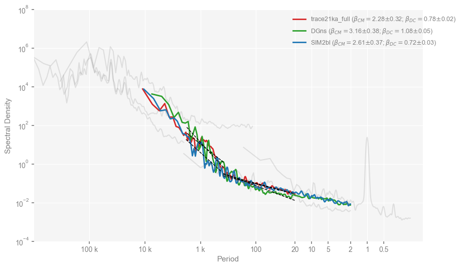
… and the lower panel of Fig. 2. Note that here we will visualize two scaling regimes, we have to do it manualy with the PSD.beta_est_res attribute.
clr_dict = {
    'EDC': 'grey',
    'HadCRUT4': 'grey',
    'GAST': 'grey',
    'ProbStack': 'grey',
    'LMR': 'grey'
}
for k, v in clr_dict.items():
    psd_wwz[k].plot_kwargs = {'color': v, 'alpha': 0.2, 'linewidth': 1.5}

mpsd_obs = pyleo.MultiplePSD([psd_wwz[name] for name in ['EDC', 'HadCRUT4', 'GAST', 'ProbStack', 'LMR']])

clr_deglacial_dict = {
    'trace21ka_full': tableau20[6],
    'DGns': tableau20[4],
    'SIM2bl': tableau20[0],
}
for k, v in clr_deglacial_dict.items():
    psd_wwz[k].plot_kwargs = {'color': v}

period_ticks = [0.5, 1, 2, 5, 10, 20, 100, 1e3, 1e4, 1e5]
period_ticklabels = ['0.5', '1', '2', '5', '10', '20', '100', '1 k', '10 k', '100 k']

fig, ax = mpsd_deglacial.plot(figsize=[10, 6])
mpsd_obs.plot(ax=ax, legend=False)
ax.set_xlim([1e6, 0.1])
ax.set_ylim([1e-4, 1e8])
ax.set_xticks(period_ticks)
ax.set_xticklabels(period_ticklabels)

labels = ax.get_legend_handles_labels()[-1]
new_labels = []
i = 0
for name in ['trace21ka_full', 'DGns', 'SIM2bl']:
    res_s = psd_wwz_beta_s[name].beta_est_res
    res_l = psd_wwz_beta_l[name].beta_est_res
    ax.plot(1/res_s['f_binned'], res_s['Y_reg'], linestyle='--', color='k', linewidth=1, zorder=99)
    ax.plot(1/res_l['f_binned'], res_l['Y_reg'], linestyle='--', color='k', linewidth=1, zorder=99)
    beta_s_str = r'$\beta_{DC}$'
    beta_s = res_s['beta']
    err_s = res_s['std_err']
    beta_l_str = r'$\beta_{CM}$'
    beta_l = res_l['beta']
    err_l = res_l['std_err']
    new_labels.append(fr'{labels[i]} ({beta_l_str}$=${beta_l:.2f}$\pm${err_l:.2f}; {beta_s_str}$=${beta_s:.2f}$\pm${err_s:.2f})')
    i += 1

ax.legend(labels=new_labels, loc='upper right', bbox_to_anchor=(1.1, 1))
ax.set_ylabel('Spectral Density')
Text(0, 0.5, 'Spectral Density')
References#
Braconnot, P., Harrison, S. P., Kageyama, M., Bartlein, P. J., Masson-Delmotte, V., Abe-Ouchi, A., et al. (2012). Evaluation of climate models using palaeoclimatic data. Nature Climate Change, 2(6), 417–424. https://doi.org/10.1038/nclimate1456
Foster, G. (1996). Wavelets for period analysis of unevenly sampled time series. The Astronomical Journal, 112, 1709. https://doi.org/10.1086/118137
Hakim, G. J., Emile‐Geay, J., Steig, E. J., Noone, D., Anderson, D. M., Tardif, R., et al. (2016). The last millennium climate reanalysis project: Framework and first results. Journal of Geophysical Research: Atmospheres, 121(12), 6745–6764. https://doi.org/10.1002/2016JD024751
Kirchner, J. W., & Neal, C. (2013). Universal fractal scaling in stream chemistry and its implications for solute transport and water quality trend detection. Proceedings of the National Academy of Sciences, 110(30), 12213–12218. https://doi.org/10.1073/pnas.1304328110
Tardif, R., Hakim, G. J., Perkins, W. A., Horlick, K. A., Erb, M. P., Emile-Geay, J., et al. (2019). Last Millennium Reanalysis with an expanded proxy database and seasonal proxy modeling. Climate of the Past, 15(4), 1251–1273. https://doi.org/10.5194/cp-15-1251-2019
Zhu, F., Emile-Geay, J., McKay, N. P., Hakim, G. J., Khider, D., Ault, T. R., Steig, E. J., Dee, S., Kirchner, J. W. (2019). Climate models can correctly simulate the continuum of global-average temperature variability. Proceedings of the National Academy of Sciences, 201809959. https://doi.org/10.1073/pnas.1809959116