Plotting Raw Data with Pyleoclim#
This notebook lays out the details of how we plot raw data using Pyleoclim objects that we loaded in the Load Data notebook.
The notebook is structured as follows:
Load and plot the raw records
# Importing relevant packages

import pickle

import pyleoclim as pyleo
import matplotlib.pyplot as plt
# Importing the data

with open("../../data/plotting_series_dict.pkl", "rb") as handle:
    plotting_series_dict = pickle.load(handle)

with open("../../data/cmap_grouped.pkl", "rb") as handle:
    cmap_grouped = pickle.load(handle)

with open("../../data/marker_dict.pkl", "rb") as handle:
    marker_dict = pickle.load(handle)
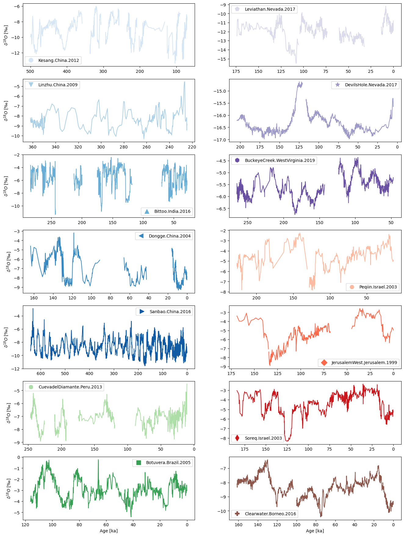
Pyleoclim has some built-in plotting functionalities for multiple records (e.g. stackplot), but we’re going to do something slightly more bespoke as we want to have multiple columns:
# Plotting the data

plot_order = [
    "Kesang.China.2012",
    "Linzhu.China.2009",
    "Bittoo.India.2016",
    "Dongge.China.2004",
    "Sanbao.China.2016",
    "CuevadelDiamante.Peru.2013",
    "Botuvera.Brazil.2005",
    "Leviathan.Nevada.2017",
    "DevilsHole.Nevada.2017",
    "BuckeyeCreek.WestVirginia.2019",
    "Peqiin.Israel.2003",
    "JerusalemWest.Jerusalem.1999",
    "Soreq.Israel.2003",
    "Clearwater.Borneo.2016",
]

fig = plt.figure(figsize=(16, 22))
gs = fig.add_gridspec(7, 2)

for idx, label in enumerate(plot_order):
    ts = plotting_series_dict[label]
    if idx <= 6:
        gs_slot = gs[idx, 0]
    else:
        gs_slot = gs[idx - 7, 1]

    ts.value_name = r"$\delta^{18}O$"
    ts.value_unit = "‰"
    ax = fig.add_subplot(gs_slot)
    ts.plot(ax=ax, color=cmap_grouped[ts.label])
    ax.legend(
        handles=[
            plt.Line2D(
                [0],
                [0],
                marker=marker_dict[label],
                color=cmap_grouped[label],
                label=label,
                markersize=10,
                linestyle="None",
            )
        ]
    ).set_visible(True)
    ax.invert_xaxis()
    if idx in [6, 13]:
        pass
    else:
        ax.set_xlabel("")
    if idx in [0, 1, 2, 3, 4, 5, 6]:
        pass
    else:
        ax.set_ylabel("")