Chapter 6 Principal Components Analysis
As always, let’s start by loading the packages we need.
library(lipdR)
library(geoChronR)
library(magrittr)
library(dplyr)
library(purrr)
library(ggplot2)
This vignette showcases the ability to perform principal component analysis (PCA, also known as empirical orthogonal function (EOF) analysis. Data are from the PalMod compilation. We’ll just load a subset of it here, but the rest is available on the LiPDverse()
FD <- lipdR::readLipd("http://lipdverse.org/geoChronR-examples/PalMod-IndianOcean/PalMod-IndianOcean.zip") ## [1] "reading: 182_1132B.lpd"
## [1] "reading: GeoB12615_4.lpd"
## [1] "reading: GIK17940_2.lpd"
## [1] "reading: GIK17961_2.lpd"
## [1] "reading: GIK18471_1.lpd"
## [1] "reading: MD01_2378.lpd"
## [1] "reading: MD02_2589.lpd"
## [1] "reading: MD06_3067.lpd"
## [1] "reading: MD06_3075.lpd"
## [1] "reading: MD73_025.lpd"
## [1] "reading: MD84_527.lpd"
## [1] "reading: MD88_770.lpd"
## [1] "reading: MD98_2181.lpd"
## [1] "reading: ODP1145.lpd"
## [1] "reading: SK157_14.lpd"
## [1] "reading: SO42_74KL.lpd"
## [1] "reading: WIND_28K.lpd"6.1 Let’s explore these data!
6.1.1 Make a map
First, let’s take a quick look at where these records are located. geoChronR’s mapLipd function can create quick maps:
mapLipd(FD,map.type = "line",f = 0.1)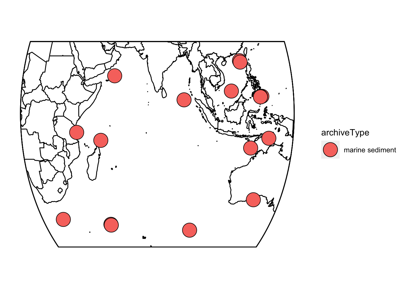
6.1.2 Grab the age ensembles for each record.
Now we need to map the age ensembles to paleo for all of these datasets. We’ll use purrr::map for this, but you could also do it with sapply(). In this case we’re going to specify that all of the age ensembles are named “ageEnsemble,” and the chron and paleo depth variables. Fortunately, the naming is consistent across PalMod, making this straightforward.
FD2 = purrr::map(FD,
                 mapAgeEnsembleToPaleoData,
                 strict.search = TRUE,
                 paleo.depth.var = "depth_merged",
                 chron.depth.var = "depth",
                 age.var = "ageEnsemble" )
6.1.3 Plot some summary statistics
In this analysis, we’re interested in spatiotemporal patterns in the Indian Ocean during the Last Deglaciation. Not all of these records cover that time interval, so let’s take a look at the temporal coverage.
indTib <- FD2 %>% extractTs() %>% ts2tibble() #create a lipd-timeseries-tibble

#use purrr to extract the minimum and maximum ages for each record
minAge <- map_dbl(indTib$age,min,na.rm = TRUE)
maxAge <- map_dbl(indTib$age,max,na.rm = TRUE)

#plot the distributions of the ages.
ggplot()+ geom_histogram(aes(x = minAge,fill = "Min age")) +
  geom_histogram(aes(x = maxAge,fill = "Max age"),alpha = 0.5) +
  scale_fill_manual("",values = c("red","black")) +
  xlab("Age")
## `stat_bin()` using `bins = 30`. Pick better value with `binwidth`.
## `stat_bin()` using `bins = 30`. Pick better value with `binwidth`.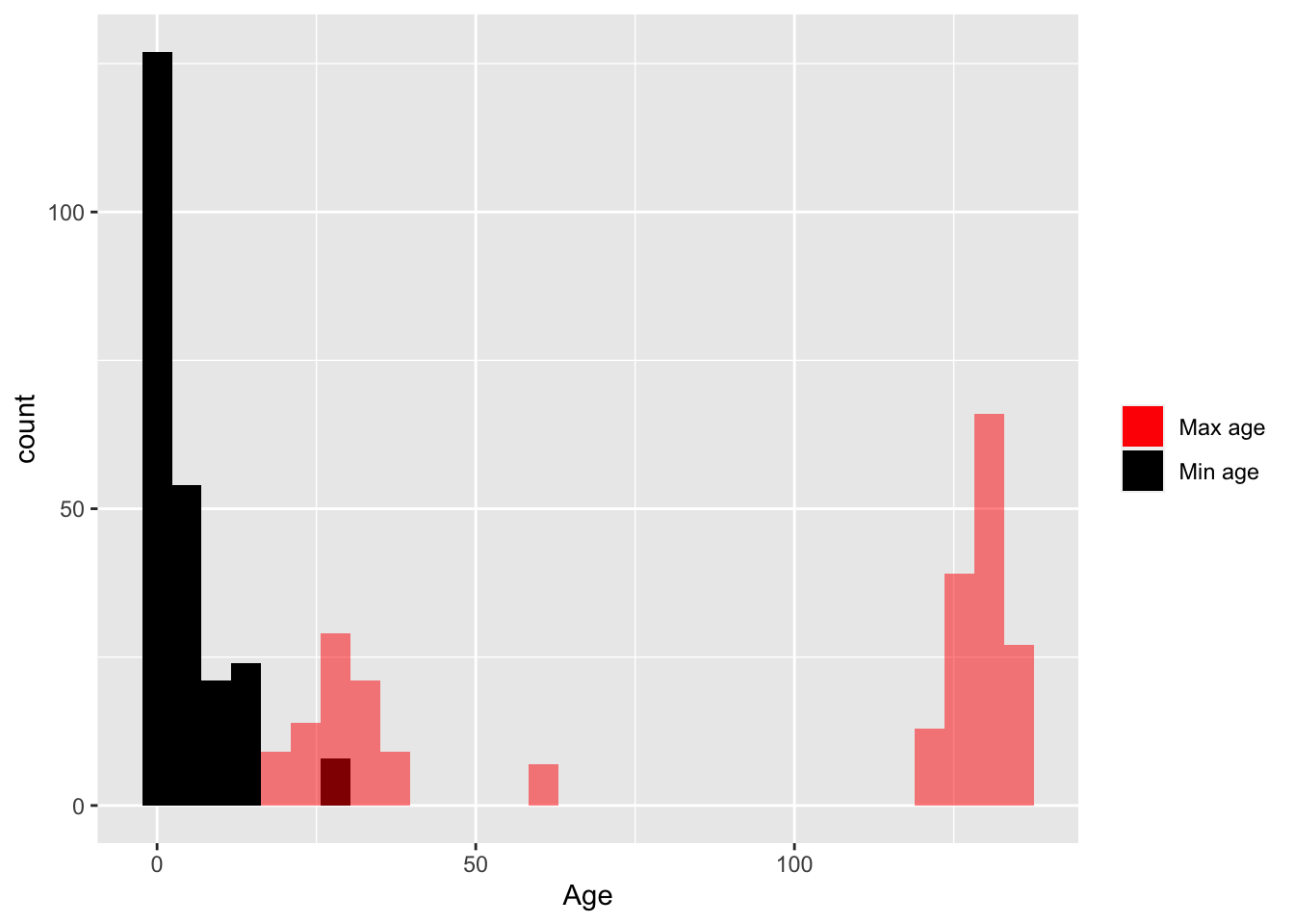 OK, so it looks like the ages range from 0 to about 150. But what are the units on those?
Exercise 6.1 Explore the LiPD data to determine the units on the ages, and update your histogram appropriately.
6.1.4 Plot the data
Let’s start by making a stack plot of the surface temperature data in this dataset, to see what we’re working with.
Exercise 6.2 Create a “stack plot” of the Surface Temperature data, ignoring age uncertainty for now.
Hint #1
First you’ll need to create a lipd-ts-tibble-long objectHint #2
Then filter it to just the variable of interestHint #3
Then use plotStack() to plot it up6.2 Filter the data
OK, there’s a lot of data that span a lot of time here. Since we’re interested in the deglaciation, we need to find which datasets span the range from at least 10,000 to 30,000 years ago, and that have enough data in that range to be useful.
There are a few ways to go about this. Here’s one that uses purrr. Feel free to try a different solution here too!
indTs <- extractTs(FD2) #create a lipd-timeseries

# create some variables for screening
startYear <- 10
endYear <- 30

#write a function to determine if the dataset has enough values within the target time frame
nGoodVals <- function(x,startYear,endYear){
  agesWithValues <- x$age[is.finite(x$paleoData_values)]
  gv <- which(agesWithValues >= startYear & agesWithValues <= endYear)
  return(length(gv))
}

#write a function to determine how much coverage the data has within that target frame
span <- function(x,startYear,endYear){
  agesWithValues <- x$age[is.finite(x$paleoData_values)]
  agesWithValues <- agesWithValues[agesWithValues >= startYear & agesWithValues <= endYear]
  sout <- abs(diff(range(agesWithValues,na.rm = TRUE)))
  return(sout)
}

#use purrr to run those functions over each item in the list
nValsInRange <- map_dbl(indTs,nGoodVals,startYear,endYear)
span <- map_dbl(indTs,span,startYear,endYear)
Now we can see for each of these timeseries how many values are between 10 and 30 ka, and how much time range that span corresponds to. We now filter our TS object down to something closer to what we’re looking for, and then select on the variable we’re looking for, in this, “surface.temp”
#use our indices from above to select only the good timeseries
TS.filtered <- indTs[nValsInRange > 20 & span > 15] %>%
  filterTs("paleoData_variableName == surface.temp") #and then select our variable of interest
## [1] "14 results after query: paleoData_variableName == surface.temp"This is the first time we’ve seen the filterTs() function. It’s part of the lipdR library, and enables simple filtering on lipd-ts objects. It’s a weaker version of dplyr::filter(), and for complex queries you’re much better off converting to a tibble and using dplyr. But for simple operations on lipd-ts objects, it works well enough.
6.2.1 Plot the data again (#plotAgain)
At this point, we should get our eyes on the data again. Let’s make a timeseries plot of the existing data.
#convert the lipd-ts object to a lipd-ts-tibble
tsTib <- ts2tibble(TS.filtered)

#convert the lipd-ts-tibble object to a lipd-ts-tibble-long
tp <- tidyTs(tsTib,age.var = "age")

#filter it only to our time range
tp <- tp %>%
  filter(between(age,10,30))

#and make a timeseries stack plot
plotTimeseriesStack(tp,time.var = "age")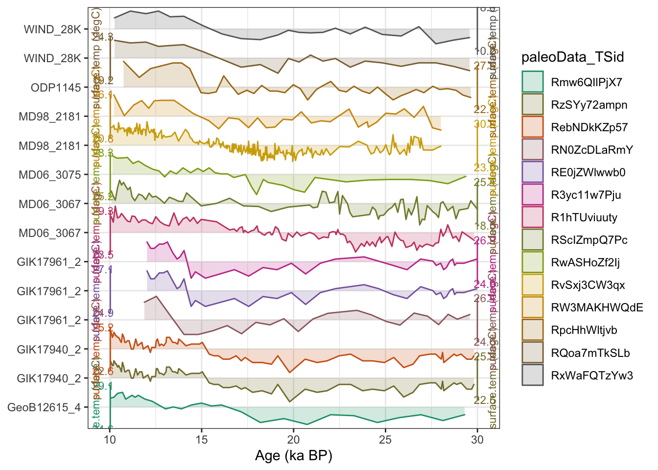
OK, it looks like our filtering worked as expected. We now have a lipd-timeseries object that contains only the timeseries we want to include in our PCA, and the age ensembles are included. We’re ready to move forward with ensemble PCA!
One thing you should notice, is that several of these temperature reconstructions come from the same site. Having multiple, semi-independent records from a single site is relatively common, and something we should consider more down the road.
To conduct PCA, we need to put all of these data onto a common timescale. We will use binning to do this, although there are also other approaches. We also want to repeat the binning across our different ensemble members, recognizing that age uncertainty affects the bins! binTs will bin all the data in the TS from 10 ka to 23 ka into 5 year bins.
binned.TS <- binTs(TS.filtered,bin.vec = seq(10,30,by=.5),time.var = "ageEnsemble")We’re now ready to calculate the PCA!
6.3 Calculate an ensemble PCA
Calculate PCA, using a covariance matrix, randomly selecting ensemble members in each iteration:
pcout <- pcaEns(binned.TS,pca.type = "cov")That was easy (because of all the work we did beforehand). But before we look at the results let’s take a look at a scree plot to get a sense of how many significant components we should expect.
plotScreeEns(pcout)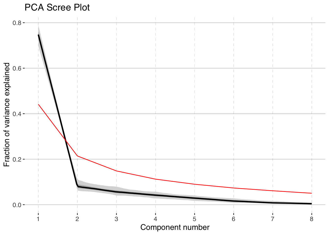
It looks like the first two components, shown in black with gray uncertainty shading, stand out above the null model (in red), but the third and beyond look marginal to insignficant. Let’s focus on the first two components.
6.3.1 Plot the ensemble PCA results
Now let’s visualize the results. The plotPcaEns function will create multiple diagnostic figures of the results, and stitch them together.
plotPCA <-  plotPcaEns(pcout,
                       TS = TS.filtered,
                       map.type = "line",
                       f=.1,
                       legend.position = c(0.5,.6),
                       which.pcs = 1:2,
                       which.leg = 2)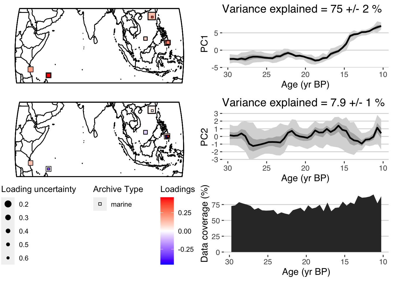
Nice! A summary plot that combines the major features is produced, but all of the components, are included in the “plotPCA” list that was exported.
For comparison with other datasets it can be useful to export quantile timeseries shown in the figures. plotTimeseriesEnsRibbons() can optionally be used to export the data rather than plotting them. The following will export the PC1 timeseries:
quantileData <- plotTimeseriesEnsRibbons(X = pcout$age,Y = pcout$PCs[,1,],export.quantiles = TRUE)

print(quantileData)
## # A tibble: 200 x 6
## ages `0.025` `0.25` `0.5` `0.75` `0.975`
## <dbl> <dbl> <dbl> <dbl> <dbl> <dbl>
## 1 10.8 5.05 6.01 6.62 7.24 8.32
## 2 10.8 5.24 6.05 6.52 7.05 7.96
## 3 10.9 5.39 6.06 6.43 6.82 7.58
## 4 11.0 5.51 6.05 6.34 6.66 7.25
## 5 11.1 5.56 5.99 6.26 6.56 7.02
## 6 11.2 5.44 5.86 6.19 6.52 6.91
## 7 11.3 5.35 5.78 6.08 6.35 6.79
## 8 11.4 5.33 5.74 5.96 6.17 6.57
## 9 11.5 5.26 5.67 5.82 6.02 6.41
## 10 11.6 5.08 5.54 5.71 5.89 6.34
## # … with 190 more rows6.3.2 Data weighting
As mentioned in /(ref?)(plotAgain), we might want to consider the fact that multiple records are coming from the same sites. This could make some sites more influential than others in the PCA. One way to account for this is by “weighting” the analysis. Here we’ll rerun the analysis, weighting each record by \(1/n\), where n is the number of records at each site.
#use pullTsVariable to pull a variable out of a lipd-ts object
sitenames <- pullTsVariable(TS.filtered,"geo_siteName")

#use purrr to weight by 1/n
weights <- purrr::map_dbl(sitenames,~ 1/sum(.x == sitenames))

names(weights) <- sitenames
weights
## GeoB12615_4 GIK17940_2 GIK17940_2 GIK17961_2 GIK17961_2 GIK17961_2 MD06_3067 MD06_3067 MD06_3075 MD98_2181
## 1.0000000 0.5000000 0.5000000 0.3333333 0.3333333 0.3333333 0.5000000 0.5000000 1.0000000 0.5000000
## MD98_2181 ODP1145 WIND_28K WIND_28K
## 0.5000000 1.0000000 0.5000000 0.5000000Now let’s rerun the PCA, using the weights
pcoutWeighted <- pcaEns(binned.TS,pca.type = "cov",weights = weights)and check out the screeplot
plotScreeEns(pcoutWeighted)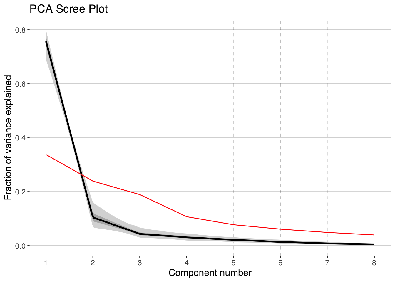
and PCA results again:
plotPCA <-  plotPcaEns(pcoutWeighted,
                       TS = TS.filtered,
                       map.type = "line",
                       f=.1,
                       legend.position = c(0.5,.6),
                       which.pcs = 1:2,
                       which.leg = 2)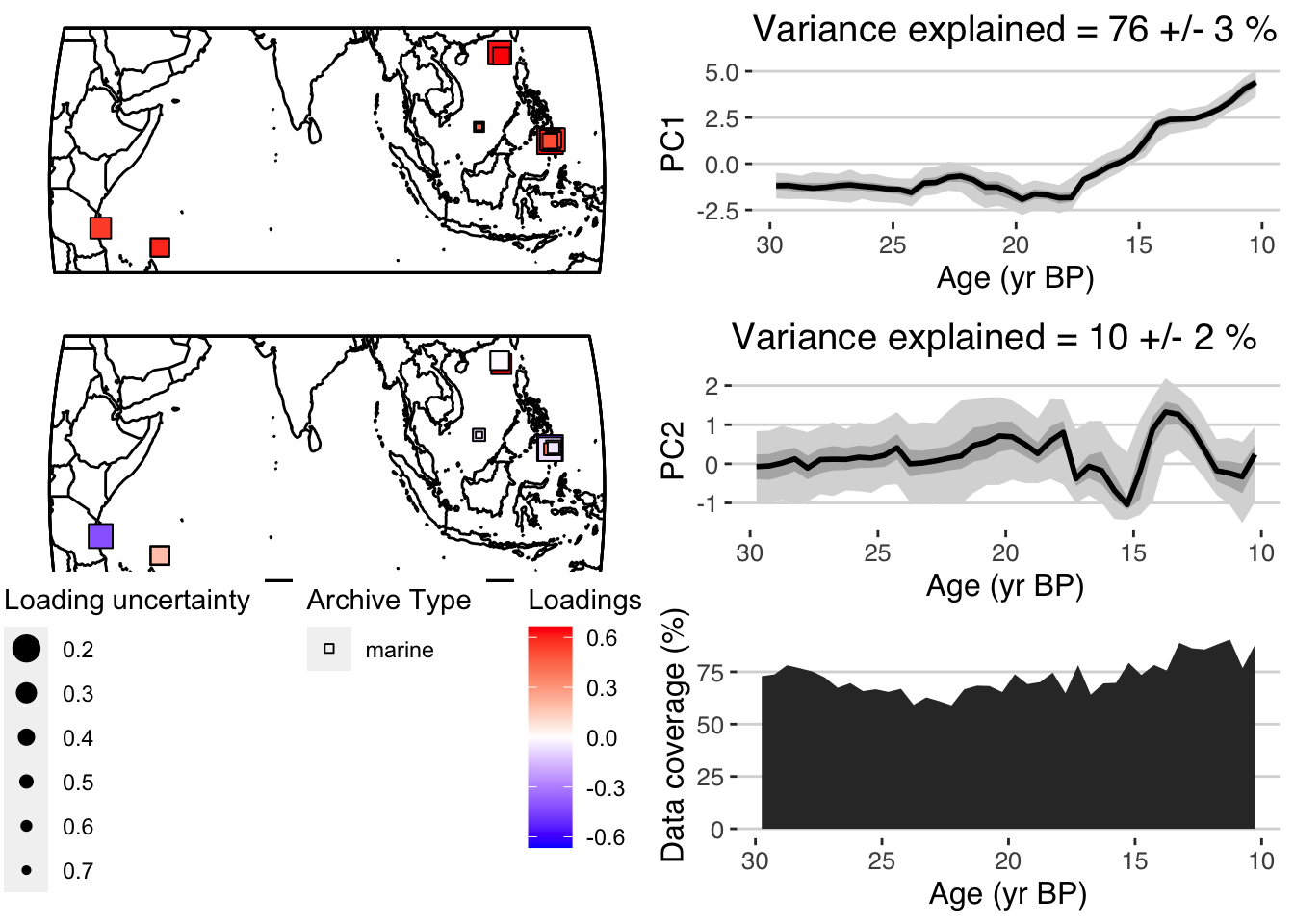
In this case, the results are pretty similar. But weighting your PCA input data is a good tool to have in your tool belt.
6.4 Ensemble PCA using a correlation matrix.
Let’s repeat much of this analysis, but this time let’s take a look at the data underlying the surface temperature reconstructions, \(\delta^{18}O\) and Mg/Ca data.
First, look at the variable names represented in our dataset. This is easiest with our tibble
tib.filtered <- indTs[nValsInRange > 20 & span > 15] %>% ts2tibble()

table(tib.filtered$paleoData_variableName)
##
## age ageEnsemble benthic.d13C benthic.d18O CaCO3 DBD depth depth_merged
## 28 11 5 7 2 1 1 11
## planktonic.d13C planktonic.d18O planktonic.MgCa surface.temp TOC UK37
## 8 13 8 14 3 3OK. Let’s filter the timeseries again, this time pulling all the \(\delta^{18}O\) and Mg/Ca data.
Exercise 6.3 Write code to filter tib.filtered to only includes the planktonic d18O and \(\delta^{18}O\) and Mg/Ca data.
Great. It’s pretty easy to filter the data if you’re used to dplyr, and if you’re not, it’s not too hard to learn. Now let’s take a look at the data.
Exercise 6.4 Create a plotStack visualizing these data. Color the timeseries by variable name.
Take a look at your plot, note the units, and the scale of the variability. Since we’re now dealing with variables in different units, we cannot use a covariance matrix.
And calculate the ensemble PCA, this time using a covariance matrix. By using a covariance matrix, we’ll allow records that have larger variability in \(\delta^{18}O\) to influence the PCA more, and those that have little variability will have little impact. This may or may not be a good idea, but it’s an important option to consider when possible.
pcout2 <- pcaEns(binned.TS2,pca.type = "corr")Once again, let’s take a look at the scree plot:
plotScreeEns(pcout2)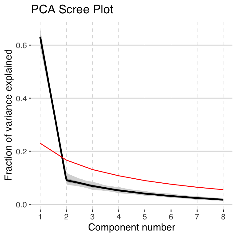
Once again, the first PC dominates the variability. All of the subsequent PCs are non signficant, but let’s include the second third PC in our plot this time as well.
Exercise 6.5 Create a PCA plot showing the output of your data. This time let’s explore the options.
- Show the first 3 PCs
- Select a different map background
- Change the shapes
- Change the color scale.
Again, the scree plot tells us that only the first EOF pattern is worth interpreting, so let’s interpret it!
- Is the timeseries more or less what you expected? How does it compare from what we got from the surface temperature data?
- The spatial pattern show high positive and high negative values? How does this compare with our previous analysis? What might be the origin of this pattern?
6.5 Chapter project
Exercise 6.6 For your chapter project for PCA, we’re going to take a bigger picture look at planktonic \(\delta^{18}O\). Specifically, I’d like you to conduct time-uncertain PCA on global planktonic \(\delta^{18}O\) data that span from 130ka up to the present. I’ve prepared a subset of the compilation that has at least 100 observations between 130 ka and the present, and that spans at least 100 kyr during that interval, which is a great start. That subset is here. You’ll have to make some decisions along the way. Go ahead and make your choices, just have a good reason for each choice you make!