Leveraging Xarray for spatiotemporal diagnostics#
Overview#
Calculating and plotting a time series of global mean anomaly serves as a useful way to highlight how to wield several xarray tools. Additionally, being able plot the spatial distribution of a property with an explicitly defined color scheme means never being at the mercy of the default colorbar again.
Calculating global mean anomaly with Xarray
Filled contours superimposed on maps with Cartopy and Matplotlib
Prerequisites#
Concepts |
Importance |
Notes |
|---|---|---|
Necessary |
||
Helpful |
Familiarity with metadata structure |
Time to learn: 10 minutes
Imports#
%load_ext autoreload
%autoreload 2

import intake
import numpy as np

import cftime

import matplotlib.pyplot as plt
import matplotlib as mpl
from matplotlib import cm
import matplotlib.gridspec as gridspec

import cartopy.crs as ccrs
import cartopy.feature as cfeature
import cartopy.util as cutil

import pyleoclim as pyleo
Calculating global mean anomaly#
First, we’ll read in some CMIP6 data from AWS using intake. For more details on querying the cloud-ready subset of the CMIP6 catalog available via AWS and Google Cloud, check out this lifehack notebook.
# for Google Cloud:
col = intake.open_esm_datastore("https://storage.googleapis.com/cmip6/pangeo-cmip6.json")

# for AWS S3:
# col = intake.open_esm_datastore("https://cmip6-pds.s3.amazonaws.com/pangeo-cmip6.json")
col
pangeo-cmip6 catalog with 7674 dataset(s) from 514818 asset(s):
| unique | |
|---|---|
| activity_id | 18 |
| institution_id | 36 |
| source_id | 88 |
| experiment_id | 170 |
| member_id | 657 |
| table_id | 37 |
| variable_id | 700 |
| grid_label | 10 |
| zstore | 514818 |
| dcpp_init_year | 60 |
| version | 736 |
| derived_variable_id | 0 |
query_d = dict(source_id='MIROC-ES2L',
     experiment_id='historical',
     grid_label='gn',
     variable_id='pr',
     member_id = 'r1i1p1f2',
     table_id='Amon'
    )
# sometimes it's necessary to request the data twice
search_res = col.search(**query_d).to_dataset_dict(require_all_on=['source_id', 'grid_label', 'table_id', 'variant_label'],#['source_id', 'experiment_id'],
                                      xarray_open_kwargs={'consolidated': True,'use_cftime':True, 'chunks':{}},
                                   storage_options={'token': 'anon'})
--> The keys in the returned dictionary of datasets are constructed as follows:
	'activity_id.institution_id.source_id.experiment_id.table_id.grid_label'
The selected query result will automatically be available as an Xarray dataset.
miroc_ds = list(search_res.values())[0]
miroc_ds
<xarray.Dataset>
Dimensions:         (lat: 64, bnds: 2, lon: 128, member_id: 1,
                     dcpp_init_year: 1, time: 1980)
Coordinates:
  * lat             (lat) float64 -87.86 -85.1 -82.31 ... 82.31 85.1 87.86
    lat_bnds        (lat, bnds) float64 dask.array<chunksize=(64, 2), meta=np.ndarray>
  * lon             (lon) float64 0.0 2.812 5.625 8.438 ... 351.6 354.4 357.2
    lon_bnds        (lon, bnds) float64 dask.array<chunksize=(128, 2), meta=np.ndarray>
  * time            (time) object 1850-01-16 12:00:00 ... 2014-12-16 12:00:00
    time_bnds       (time, bnds) object dask.array<chunksize=(1980, 2), meta=np.ndarray>
  * member_id       (member_id) object 'r1i1p1f2'
  * dcpp_init_year  (dcpp_init_year) float64 nan
Dimensions without coordinates: bnds
Data variables:
    pr              (member_id, dcpp_init_year, time, lat, lon) float32 dask.array<chunksize=(1, 1, 600, 64, 128), meta=np.ndarray>
Attributes: (12/60)
    Conventions:                      CF-1.7 CMIP-6.2
    activity_id:                      CMIP
    branch_method:                    standard
    branch_time_in_child:             0.0
    branch_time_in_parent:            0.0
    cmor_version:                     3.3.2
    ...                               ...
    intake_esm_attrs:variable_id:     pr
    intake_esm_attrs:grid_label:      gn
    intake_esm_attrs:zstore:          gs://cmip6/CMIP6/CMIP/MIROC/MIROC-ES2L/...
    intake_esm_attrs:version:         20190823
    intake_esm_attrs:_data_format_:   zarr
intake_esm_dataset_key: CMIP.MIROC.MIROC-ES2L.historical.Amon.gnIt is not uncommon for one set of units to be optimal for one calculation, but far less so for another. Below we’ll make variables for precipitation rate in mm/day, time in years and latitude in radians following the form:
ds.assign(new_var_name = new_var_value)
This is pretty much as one would expect except new_var_name will become the name of the variable (usually done with a string assignment) while here is assigned values in the style of a variable assignment. [There’s a decent chance that if this footnote seemed obscure, you are unlikely to make the mistake it is addressing, so proceed with confidence!]
# convert prate_mean from kg/(m^2*s) to mm/day
prate_unit_conversion = 86400
miroc_ds=miroc_ds.assign(pr_mmday=miroc_ds['pr'] * prate_unit_conversion)
# create a variable for year
miroc_ds = miroc_ds.assign(year=miroc_ds['time'].dt.year)
# create a variable for latitude in radians
miroc_ds= miroc_ds.assign(lat_rad=np.deg2rad(miroc_ds['lat']))
Calculating anomalies#
In some instances, it is useful to work with the central tendency (e.g. mean, or median) but in other cases we are interested in the anomaly–the residual between a value and some central tendency established using the full timeseries, or perhaps a reference interval.
If we want to calculate the monthly anomaly relative to the reference interval 1900 to 1980:
calculate climatology for the interval 1900 to 1980
group data by month and subtract climatology
interval = [1900, 1980]
interval_ds = miroc_ds.sel(time=(miroc_ds.time.dt.year < interval[1]) |
                     (miroc_ds.time.dt.year >= interval[0]))

time_unit = 'time.month' #time_unit is a string
miroc_climatology = interval_ds.groupby(time_unit).mean("time")
pr_mmday_anom = (miroc_ds.groupby(time_unit) - miroc_climatology)['pr_mmday']
miroc_ds = miroc_ds.assign(pr_mmday_anom=pr_mmday_anom)
/Users/jlanders/opt/miniconda3/envs/paleobook-dev/lib/python3.10/site-packages/xarray/core/indexing.py:1440: PerformanceWarning: Slicing with an out-of-order index is generating 165 times more chunks
  return self.array[key]
Alternatively, we could use time.season if we wanted seasonal anomaly instead of monthly anomaly… dealer’s choice.
# wrapping these  steps into functions...
def calc_climatology(ds, time_unit='time.month', interval=None):
    if type(interval) not in [list, set, tuple]:
        interval_ds = ds
    else:
        interval_ds = ds.sel(time=(ds.time.dt.year < max(interval)) | (ds.time.dt.year >= min(interval)))
    climatology = interval_ds.groupby(time_unit).mean("time")
    return climatology

def remove_seasonality(ds, climatology, time_unit='time.month'):
    anomalies = ds.groupby(time_unit) - climatology
    return anomalies
Calculating weighted means#
Sometimes it is practical to apply weights before doing a calculation. In addition to the many project-specific adjustments that exist, there are common instances in which we use bins–for example, a grid cell, or a month–that may each constitute an item on a list with equal weight in the eyes of a mathematical operator, but which as a practical matter should have different levels of influence on aggregate values.
It may be tempting to simply apply .mean(), taking the average of all data for a given timestep, but not all grid cells cover the same area! (Indeed, the area of grid cells shrinks to 0 as one approaches the poles.) Happily, we can take advantage of one of Xarray’s built in functions, weighted to correct for this and give the earth’s curvature its due.
The
latcoordinate is in degrees North, so we’ll use Numpy, a core Python scientific computing package, to convert to radians and then take the cosine to arrive at a vector of latitude weights (weights).weightsis a transformed version oflatso Xarray infers that it should be applied along thelatcoordinate.
lat_weights = np.cos(np.deg2rad(miroc_ds.lat))
lat_weights.name = "lat_weights"

ds_lat_weighted = miroc_ds.weighted(lat_weights)
ds_global_mean = ds_lat_weighted.mean(("lon", "lat"))['pr_mmday_anom']
miroc_ds["pr_mmday_anom_gm"] = ("time", ds_global_mean.squeeze().data)
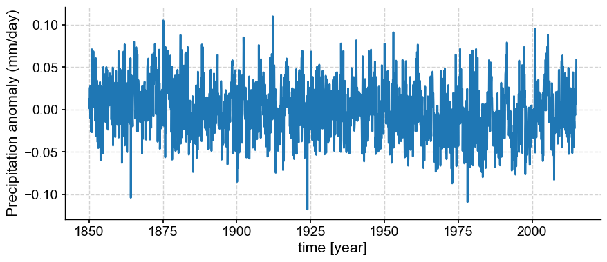
To make this more ingestable for plotting purposes, it helps to convert time to fractional years.
miroc_time_float = cftime.date2num(miroc_ds.time.data,
                                   'months since 0-1-1',
                                    calendar='360_day',
                                   has_year_zero=True)*1/12
ps_month = pyleo.Series(time=miroc_time_float,
                  value=miroc_ds["pr_mmday_anom_gm"].data, time_unit='year',
                  value_name='Precipitation anomaly (mm/day)',
                  clean_ts=False,
                  verbose=False)
ps_month.plot();
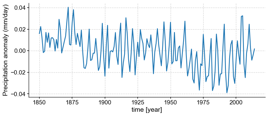
Annualizing#
If we want to see less of the high frequency variability, we can take the final step of annualizing.
def annualize(ds):
    ds_annualized = ds.groupby('time.year').mean('time')
    return ds_annualized
pr_mmday_anom_gm_annual = annualize(miroc_ds["pr_mmday_anom_gm"])
ps_annual = pyleo.Series(time=pr_mmday_anom_gm_annual.year,
                  value=pr_mmday_anom_gm_annual.squeeze().data,
                  time_unit='year',
                  value_name='Precipitation anomaly (mm/day)',
                  clean_ts=False,
                  verbose=False)
ps_annual.plot();
Pcolor maps with Cartopy#
Spatial snapshots with filled contours are useful ways of describing a snapshot in time.
Contour Map Elements
Figure with a defined
projection(map projection); add features (e.g. coastlines)add_cyclic_point, putting data on a coordinate system that renders continuously between lon=360 and lon=0Plot contour or contourf with
lonc, lat, and data processed by the cyclic transformColorbar
month = 3
year = 1877
var = 'pr_mmday_anom'
colorbar_units = '[mm/day]'
ppt_cmap = 'BrBG'
title_copy = 'Precipitation Anomaly, {}/{} \n(ref. int: (1900-1980))'
snapshot_data = miroc_ds.isel(time=(miroc_ds.time.dt.year == year) & (miroc_ds.time.dt.month == month))
Global precipitation anomaly (filled contours)#
fig = plt.figure(figsize=(8, 4))

# add subplot with specified map projection and coastlines (GeoAxes)
ax2 = fig.add_subplot(projection=ccrs.Robinson(central_longitude=0))
ax2.add_feature(cfeature.COASTLINE, edgecolor='k',linewidth=.5)

# place data on coordinate system with continuous x axis (longitude axis)
tas_c, lonc = cutil.add_cyclic_point(snapshot_data[var], snapshot_data['lon'])
# plot contourf on ax2 (geosubplot)
cf2 = ax2.contourf(lonc,snapshot_data['lat'],tas_c.squeeze(), cmap=ppt_cmap,
                   transform=ccrs.PlateCarree())

# add annotations (colorbar, title)
plt.colorbar(cf2, label=colorbar_units)
ax2.set_title(title_copy.format(month, year));
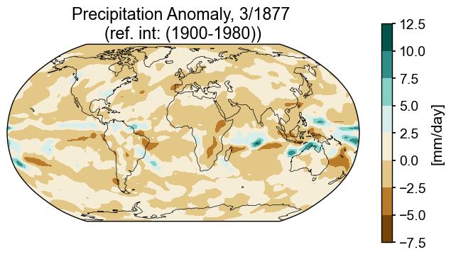
Not bad, but if we want to place this in a dashboard with other plots, it would help to have a colorbar that behaves predictably. One way to do that is to make a separate axis for a colorbar and then construct the colorbar from the contour information directly, rather than having matplotlib produce it as an afterthought. One of the ways matplotlib places colorbars is by allowing them to share a fraction of the plotting axis. This isn’t particularly concerning when there is only one plot in the mix, but can become less tidy when there are multiple plots, each with a colorbar that requires a different amount of space for labelling, etc.
Enter: GridSpec. The gridspec functionality in matplotlib improves the odds that objects of interest will reside in their assigned slots in a grid. Broadly, a grid includes information about the number of rows and columns, and optionally, about the size of each margin(top, bottom, left, right), the space between columns (wspace) or rows (hspace), and the relative sizes of rows width_ratios and columns (height_ratios).
fig = plt.figure(figsize=(8, 4))
# 1 row, 2 columns, .05 space between columns, 6:.3 ratio of left column to right column
gs = gridspec.GridSpec(1, 2, wspace=0.05, width_ratios=[8, .3])

# add subplot with specified map projection and coastlines (GeoAxes)
ax2 = fig.add_subplot(gs[0, 0], projection=ccrs.Robinson(central_longitude=0))
ax2.add_feature(cfeature.COASTLINE, edgecolor='k',linewidth=.5)

# place data on coordinate system with continuous x axis (longitude axis)
tas_c, lonc = cutil.add_cyclic_point(snapshot_data[var], snapshot_data['lon'])
# plot contourf on ax2 (geosubplot)
cf2 = ax2.contourf(lonc,snapshot_data['lat'],tas_c.squeeze(),
                   transform=ccrs.PlateCarree(), cmap=ppt_cmap)

# add annotations (colorbar, title)
ax2_cb = fig.add_subplot(gs[0, 1])
cb2 = plt.colorbar(cf2, cax = ax2_cb, orientation='vertical',label=colorbar_units)
ax2.set_title(title_copy.format(month, year));
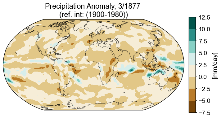
That’s an improvement. It would be possible to fiddle with the various knobs to arrive at whatever spacing seemed most comfortable, but this will suffice for the time being.
However, if we want to dictate the specifics of the color scheme because we want to make sure that the range is tuned to cover multiple plots, or just because we disagree with matplotlib’s best effort, we might be better served by explicitly defining and then mandating a colorbar.
In the final version of this plot the colorbar is constructed by building a scale with 15 levels ranging between plus and minus the maximum amplitude. One of the shortcomings of the plot above is that 0 does not correspond to no color (white). Rather than following the default range, -7.5 to 12.5, we’ll take the maximum absolute value of the minimum and max and use it as the amplitude of the colorbar. If we dictate that the colorbar will have an odd number of levels, we will guarantee that 0 will be in the middle and all values will be covered. Of course, there is not “one size fits all” because different data are best served by different strategies, but this is one useful one.
The contourf function requires information about the range of values, the color map, and how values are distributed across that color map. Collectively, this information is a ScalarMappable. Because we’ll want to do this again later on, let’s write a funcfion to do the task.
def make_scalar_mappable(lims, cmap, n=None):
    ax_norm = mpl.colors.Normalize(vmin=min(lims), vmax=max(lims), clip=False)
    if n is None:
        ax_cmap = plt.get_cmap(cmap)
    else:
        ax_cmap = plt.get_cmap(cmap, n)
    ax_sm = cm.ScalarMappable(norm=ax_norm, cmap=ax_cmap)
    return ax_sm
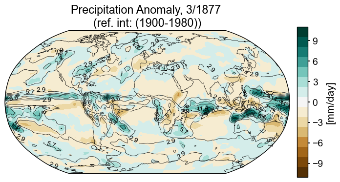
Global precip anomaly (filled contours) with precip contour lines#
Now that we have the color scheme, we’ll replot.
In this final version, we’ll add contours for the magnitude of monthly precipitation (as opposed to anomaly) to demonstrate how to add contour lines for another variable on top of the filled contours. This short function, fmt (adapted from matplotlib documentation) formats the labels for the contour lines.
# establish scale
ax2_Li_1 = max([np.abs(snapshot_data[var].max().compute()),
                np.abs(snapshot_data[var].min().compute())])
ax2_levels = np.around(np.linspace(-ax2_Li_1, ax2_Li_1, 15), decimals=1)
# make scalar mappable
ax2_sm = make_scalar_mappable([ax2_Li_1, -ax2_Li_1], ppt_cmap, 15)
cf2_kwargs = {'cmap':ax2_sm.cmap, 'norm' : ax2_sm.norm}
# This custom formatter removes trailing zeros, e.g. "1.0" becomes "1"
def fmt(x):
    s = f"{x:.1f}"
    if s.endswith("0"):
        s = f"{x:.0f}"
    return rf"{s}" if plt.rcParams["text.usetex"] else f"{s}"
nc = 21
zrange = 20
fig = plt.figure(figsize=(8, 4))
# 1 row, 2 columns, .05 space between columns, 8:.3 ratio of left column to right column
gs = gridspec.GridSpec(1, 2, wspace=0.05, width_ratios=[8, .3])

# add subplot with specified map projection and coastlines (GeoAxes)
ax2 = fig.add_subplot(gs[0, 0], projection=ccrs.Robinson(central_longitude=0))
ax2.add_feature(cfeature.COASTLINE, edgecolor='k',linewidth=.5)

# place data on coordinate system with continuous x axis (longitude axis)
tas_c, lonc = cutil.add_cyclic_point(snapshot_data[var], snapshot_data['lon'])
# plot contourf on ax2 (geosubplot)
cf2 = ax2.contourf(lonc,snapshot_data['lat'],tas_c.squeeze(),nc, levels=ax2_levels,
                   transform=ccrs.PlateCarree(), **cf2_kwargs)
# add contours
zg_c , _ = cutil.add_cyclic_point(snapshot_data['pr_mmday'], snapshot_data['lon'])
cf2_lines = ax2.contour(lonc,snapshot_data['lat'], zg_c.squeeze(), np.linspace(-zrange,zrange,15),
                            colors='k',
                            transform=ccrs.PlateCarree(), linewidths=.5)
ax2.clabel(cf2_lines, cf2_lines.levels, inline=True, fmt=fmt, fontsize=10)

# add annotations (colorbar, title)
ax2_cb = fig.add_subplot(gs[0, 1])
# check to see if it is reasonable to opt for integer ticks
if max(ax2_levels)-min(ax2_levels)>3:
    int_ticks = [np.around(loc, decimals=0) for ik, loc in enumerate(ax2_levels) if ik%2>0]
# if there are enough ticks, keep the integer ticks, otherwise, allow for floats
if len(int_ticks)>4:
    ticks = int_ticks
else:
    ticks=[loc for ik, loc in enumerate(ax2_levels) if ik%2>0]
cb2 = plt.colorbar(ax2_sm,cax=ax2_cb, orientation='vertical',label=colorbar_units,
                   ticks=ticks)
cb2.minorticks_off()

ax2.set_title(title_copy.format(month, year));
Summary#
Xarray is rich in functions that support climate science related calculations. Here, we looked at a few that make it simpler to calculate anomalies and weighted averages, but don’t stop here! Check out the xarray documentation to see if there are other offerings that might facilitate your routine calculations! Additionally, plotting data on maps can be anywhere from mildly cumbersome to frustrating, depending on how particular you are about formatting. Hopefully, the discussion here provided you with some tools to make map plotting more predictable.
What’s next?#
Check out our science bit about climatic response to volcanic events to see how spatial snapshots of climate anomalies can be pulled together in a dashboard to get a multivariate overview.
Resources and references#
Citations |
|---|
Kageyama, M., Braconnot, P., Harrison, S. P., Haywood, A. M., Jungclaus, J. H., Otto-Bliesner, B. L., Peterschmitt, J.-Y., Abe-Ouchi, A., Albani, S., Bartlein, P. J., Brierley, C., Crucifix, M., Dolan, A., Fernandez-Donado, L., Fischer, H., Hopcroft, P. O., Ivanovic, R. F., Lambert, F., Lunt, D. J., Mahowald, N. M., Peltier, W. R., Phipps, S. J., Roche, D. M., Schmidt, G. A., Tarasov, L., Valdes, P. J., Zhang, Q., and Zhou, T.: The PMIP4 contribution to CMIP6 – Part 1: Overview and over-arching analysis plan, Geosci. Model Dev., 11, 1033–1057, https://doi.org/10.5194/gmd-11-1033-2018, 2018. |