
Overview of Pyleoclim: Efficient & Flexible Timeseries Analysis#
by Deborah Khider, Julien Emile-Geay, Alexander James, Feng Zhu, Jordan Landers
Preamble#
Goals:#
Get acquainted with the Pyleoclim package, namely the objects and their associated methods
Learn to create a Series object from a csv file
Call the default methods for plotting, spectral and wavelet analysis
Construct workflows with Pyleoclim
Reading Time:
10 minutes
Keywords#
Visualization; Signal Processing; Spectral Analysis; Wavelet Analysis; Method Cascading
Pre-requisites#
None. This tutorial assumes basic knowledge of Python. If you are not familiar with this coding language, check out this tutorial: http://linked.earth/LeapFROGS/
Relevant Packages#
Pandas; Matplotlib
Data Description#
Sea-surface temperature from Kaplan (1998) averaged over the NINO3 (5N-5S, 150W-190E)) region.
Demonstration#
Let us import the packages needed for this tutorial:
%load_ext watermark
import pyleoclim as pyleo
import pandas as pd
The watermark extension is already loaded. To reload it, use:
  %reload_ext watermark
Step 1: Create a Series object from a csv file#
To do so, we will first read the data from a csv file and load into a Pandas DataFrame:
df = pd.read_csv('../data/wtc_test_data_nino_even.csv')
df.head()
| t | air | nino | |
|---|---|---|---|
| 0 | 1871.000000 | 87.36090 | -0.358250 |
| 1 | 1871.083333 | -21.83460 | -0.292458 |
| 2 | 1871.166667 | -5.52632 | -0.143583 |
| 3 | 1871.250000 | 75.73680 | -0.149625 |
| 4 | 1871.333333 | 105.82000 | -0.274250 |
Next we create a Series object from the columns of the DataFrame:
ts_nino = pyleo.Series(time =  df['t'], value = df['nino'], label = 'Kaplan Niño3 SST',
                  time_name = 'Year', value_name = 'NINO3 index',
                  time_unit = 'CE',   value_unit = '$^{\circ}$C', verbose=False)
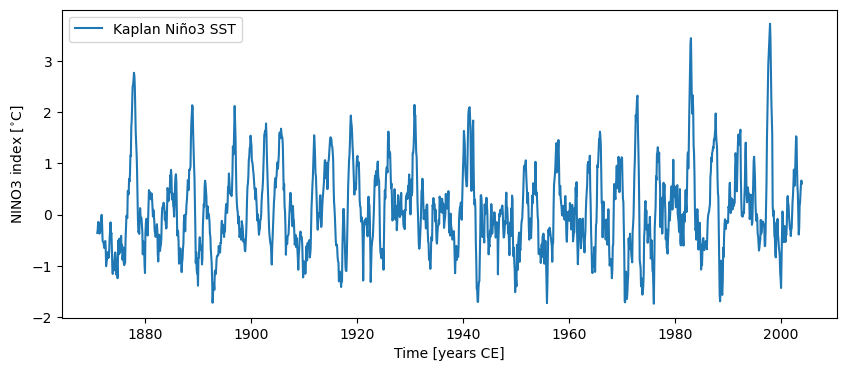
Let’s make a simple plot:
fig, ax = ts_nino.plot()
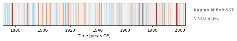
You can also make a warming stripe for this Series:
fig, ax = ts_nino.stripes(ref_period=(1961,1990), show_xaxis=True)
Step 2: Pre-processing#
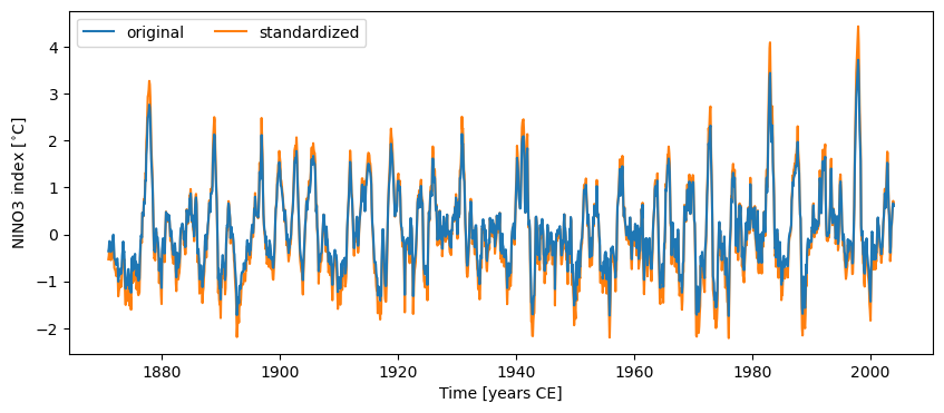
Pyleoclim has multiple functionalities to pre-process a timeseries, including standardizing, detrending, interpolation, and much more. You can learn about the various pre-processing steps in the basic Series manipulations, filtering and detrending, and uniform time sampling tutorials. As an example of one treatment, let’s standardize the data and plot it against the original values.
ts_nino_std = ts_nino.standardize()

fig, ax = ts_nino.plot(label='original', zorder=99) # a high zorder ensures this is plotted on top
ax = ts_nino_std.plot(label='standardized', ax=ax, lgd_kwargs={'ncol': 2})
For more on graphics customizations, see figures with multiple panels.
Step 3: Spectral Analysis#
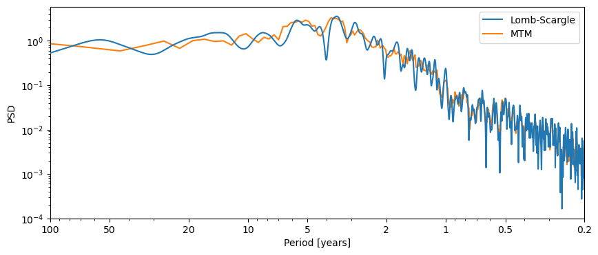
Pyleoclim makes it simple to perform spectral analysis. Calling the .spectral() method will yield a PSD (power spectral density) object of the corresponding series. Unless specified otherwise, .spectral() uses the Lomb-Scargle periodogram (method='lomb_scargle), which can handle both evenly-spaced data and unevenly-spaced data with great speed. However, it has known biases, so it may be appropriate to specify an alternative method, like the Multi-Taper Method, which can only handle evenly-spaced data. For our example data, both methods apply.
psd_wwz = ts_nino_std.spectral()  # method='lomb-scargle' by default
psd_mtm = ts_nino_std.spectral(method='mtm')  # method='mtm'
We can then plot the results of our analyses on the same figure:
fig, ax = psd_wwz.plot(label='Lomb-Scargle',zorder=99)
ax = psd_mtm.plot(ax=ax, label='MTM')
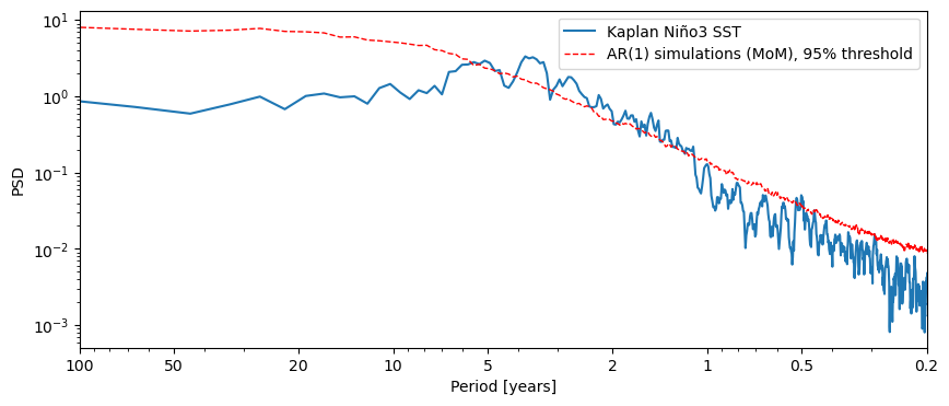
To identify notable periodicities, we need to perform some significance test.
Currently, Pyleoclim supports the test against an AR(1) benchmark, which can be performed by simply calling the signif_test() method, which uses 200 surrogate series by default:
psd_mtm_signif = ts_nino_std.spectral(method='mtm').signif_test()
Performing spectral analysis on individual series: 100%|██████████| 200/200 [00:07<00:00, 25.23it/s]
Calling the plot() method on our psd_mtm_signif object will return a plot of the PSD along with the AR(1) threshold curve, which we can use to identify the significant cycles.
fig, ax = psd_mtm_signif.plot()
For more details, see the spectral analysis notebook.
Step 4: Wavelet Analysis#
The current version of Pyleoclim supports the wwz method for wavelet analysis on unevenly-spaced records and the cwt method for evenly-spaced records. wwz is more flexible than cwt in the sense that it can be used on any record, but is much slower (no free lunch!). To perform wavelet analysis we simply call the wavelet() method, which will in turn create a Scalogram object. Since our data is evenly spaced, we’ll use cwt, which is the default:
scal = ts_nino_std.wavelet()
fig, ax = scal.plot()
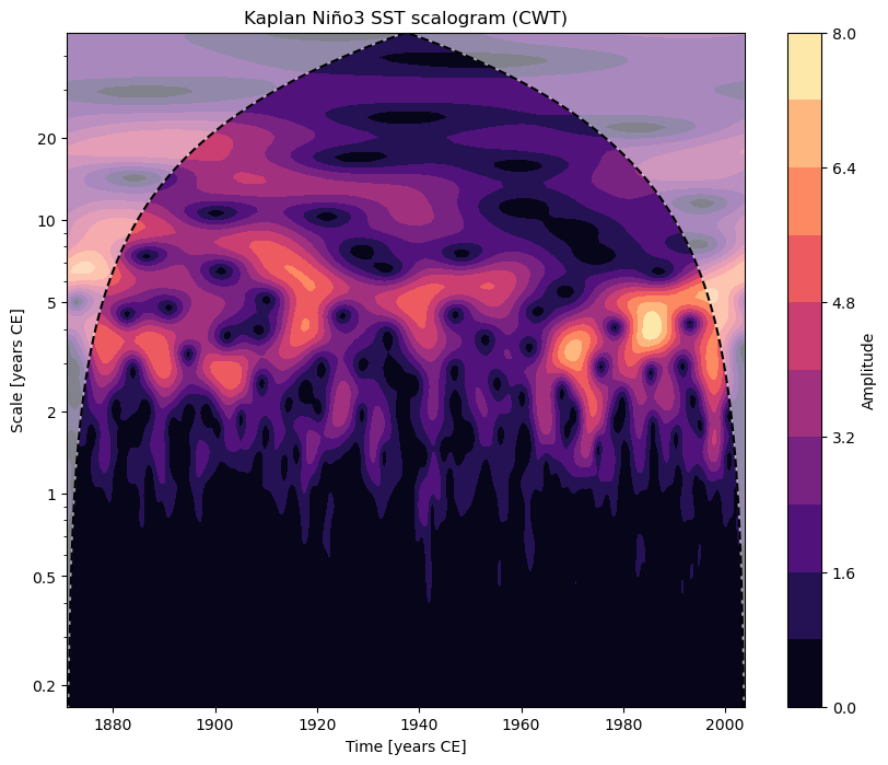
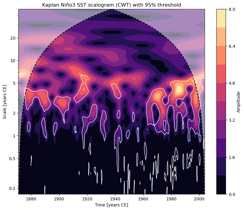
Notice how the title got built automatically from the figure metadata. We can also perform significance analysis the same way we did when conducting spectral analysis:
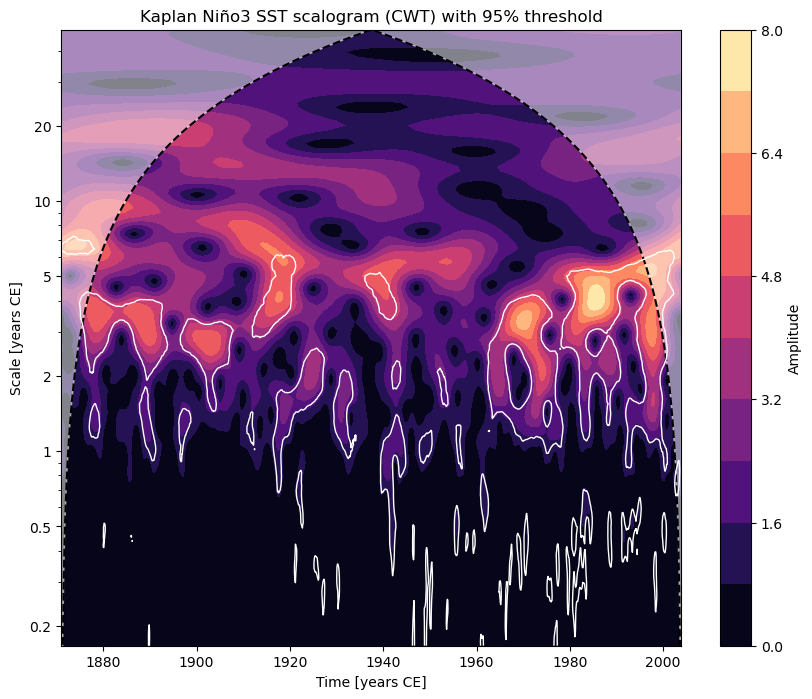
scal_signif = ts_nino_std.wavelet().signif_test()
Performing wavelet analysis on individual series: 100%|██████████| 200/200 [00:06<00:00, 31.95it/s]
In this case, regions of significance (those that exceed the 95% confidence threshold found using AR1 surrogates) will be outlined in white.
fig, ax = scal_signif.plot()
For more details, see the wavelet analysis notebook.
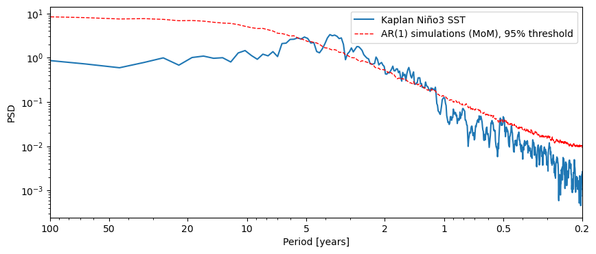
One more thing: method cascading#
Life is short. Pyleoclim provides a very cool feature to make life a little bit easier: “method cascading”. This feature allows us to string together the steps of a multi-step workflow in just one line.
fig, ax = ts_nino.standardize().spectral(method='mtm').anti_alias().signif_test().plot()
Performing spectral analysis on individual series: 100%|██████████| 200/200 [00:06<00:00, 32.44it/s]
Same thing with wavelet analysis:
fig, ax = ts_nino.standardize().wavelet().signif_test().plot()
Performing wavelet analysis on individual series: 100%|██████████| 200/200 [00:06<00:00, 31.12it/s]
If you think some of this could serve your goals, try the other notebooks in this repository.
%watermark -n -u -v -iv -w
Last updated: Thu, 12 Mar 2026

Python implementation: CPython
Python version       : 3.12.11
IPython version      : 9.6.0

pandas   : 2.3.3
pyleoclim: 1.2.1b0

Watermark: 2.6.0