
Basic timeseries manipulation#
by Jordan Landers, Julien Emile-Geay
Preamble#
Pyleoclim has multiple functionalities to pre-process a timeseries including standardizing, detrending, and interpolation. You can learn about the various pre-processing steps in Notebooks .ipynb and ipynb. Here, we simply standardize the data and plot it against the original data:
Goals:#
Learn to specify a slice of a
SeriesLearn to quickly view summary statistics of a
SeriesLearn to standardize a
SeriesLearn to gaussianize a
Series
Reading Time:
5 minutes
Keywords#
Summary Statistics; Standardize; Gaussianize;
Pre-requisites#
None. This tutorial assumes basic knowledge of Python. If you are not familiar with this coding language, check out this tutorial.
Relevant Packages#
Pandas, Seaborn
Data Description#
Sea-surface temperature from Kaplan (1998) averaged over the NINO3 (5N-5S, 150W-190E)) region.
Demonstration#
Load a sample dataset#
%load_ext watermark

import pyleoclim as pyleo
import pandas as pd
import seaborn as sns
Pyleoclim ships with a few pre-defined datasets:
pyleo.utils.available_dataset_names()
['SOI',
 'NINO3',
 'HadCRUT5',
 'AIR',
 'LR04',
 'AACO2',
 'EDC-dD',
 'GISP2',
 'cenogrid_d18O',
 'cenogrid_d13C']
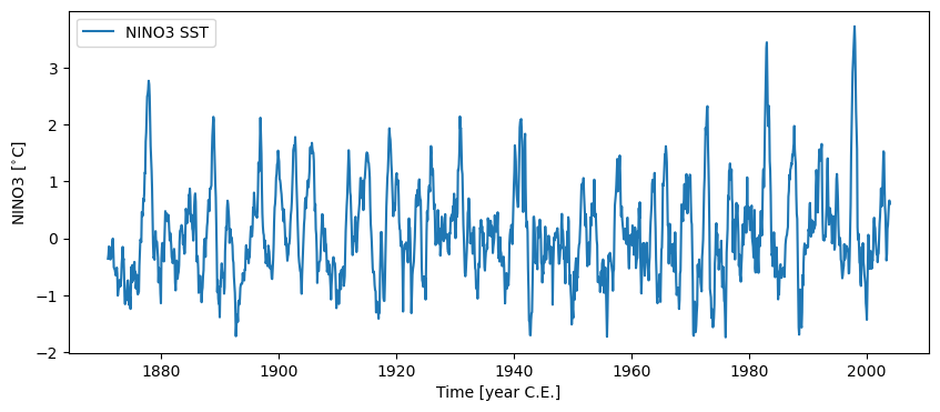
Let’s load the NINO3 timeseries and plot it:
nino3 = pyleo.utils.load_dataset('NINO3')
nino3.plot()
(<Figure size 1000x400 with 1 Axes>,
 <Axes: xlabel='Time [year C.E.]', ylabel='NINO3 [$^{\\circ}$C]'>)
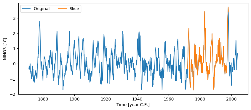
Slicing#
Passing a list containing a pair of dates to .sel() will return the time slice of interest. Notice that the syntax involves “slice”:
nino_slice = nino3.sel(time=slice(1972, 1998))
fig, ax = nino3.plot(label='Original')
nino_slice.plot(label='Slice', color='C1', ax=ax, lgd_kwargs={'ncol': 2})
<Axes: xlabel='Time [year C.E.]', ylabel='NINO3 [$^{\\circ}$C]'>
Stats#
Calling .stats() will return a handy dictionary of summary statistics (mean, median, min, max, standard deviation, and the interquartile range (IQR))
nino3.stats()
{'mean': np.float64(0.07816584993045111),
 'median': np.float64(-0.022333334),
 'min': np.float64(-1.739667),
 'max': np.float64(3.724903),
 'std': np.float64(0.8216852391762094),
 'IQR': np.float64(1.015916675)}
Or you could do it the pandas way:
nino3.to_pandas().describe()
count    1596.000000
mean        0.078166
std         0.821943
min        -1.739667
25%        -0.487979
50%        -0.022333
75%         0.527937
max         3.724903
Name: NINO3, dtype: float64
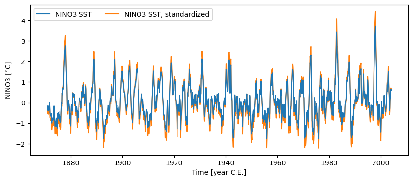
Standardizing#
Calling .standardize() subtracts the mean of the series and divides by the standard deviation.
nino3_std = nino3.standardize()
nino3_std.label = nino3.label + ', standardized'
nino3_std.stats()
{'mean': np.float64(1.3356066461656018e-17),
 'median': np.float64(-0.12230861543917694),
 'min': np.float64(-2.212322630686346),
 'max': np.float64(4.438119338404606),
 'std': np.float64(0.9999999999999998),
 'IQR': np.float64(1.2363817999438809)}
fig, ax = nino3.plot(zorder=99) # this high zorder ensures that it plots on top
ax = nino3_std.plot(ax=ax, lgd_kwargs={'ncol': 2})
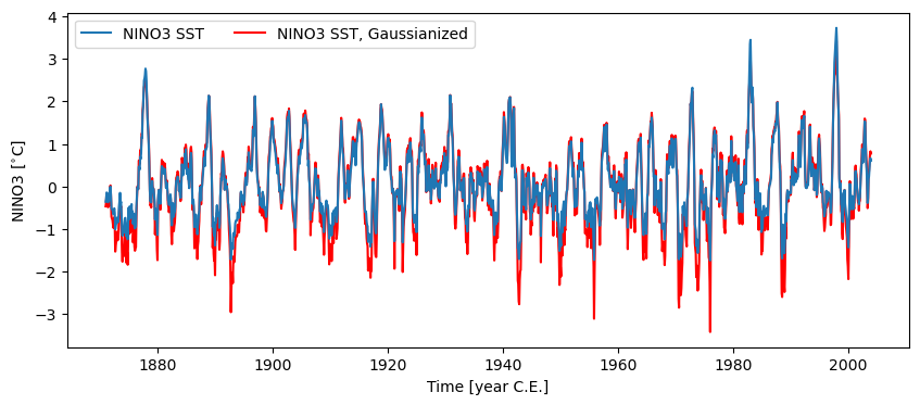
Gaussianize#
Calling .gaussianize() maps the series to a standard Gaussian distribution. Not only will it have unit standard deviation (\(\sigma=1\)), a mean (and median) of 0, but its distribution is now the famed Bell Curve. This may be useful for methods that require data to be normally distributed.
nino3_gaus = nino3.gaussianize()
nino3_gaus.label = nino3.label + ', Gaussianized'
nino3_gaus.stats()
{'mean': np.float64(1.7808088615541357e-17),
 'median': np.float64(0.0),
 'min': np.float64(-3.419845799144218),
 'max': np.float64(3.419845799144218),
 'std': np.float64(0.9995910124024003),
 'IQR': np.float64(1.347994295650057)}
fig, ax = nino3.plot(zorder=99)
ax = nino3_gaus.plot(ax=ax, lgd_kwargs={'ncol': 2}, **{'color':'red'})
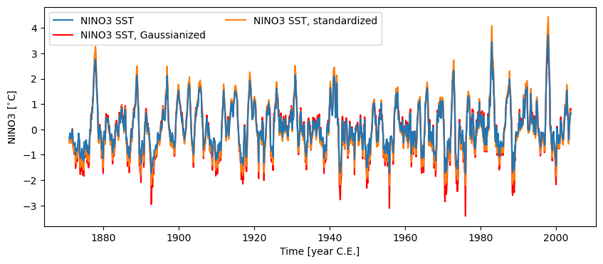
Plotting all of them together:
fig, ax = nino3.plot(zorder=99)
ax = nino3_gaus.plot(ax=ax, lgd_kwargs={'ncol': 2}, **{'color':'red'})
ax = nino3_std.plot(ax=ax, lgd_kwargs={'ncol': 2})
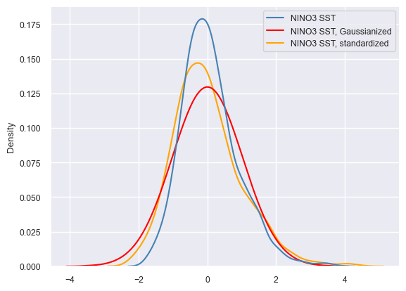
Comparison#
For context, it is interesting to compare the different treatments. Seaborn is a very useful plotting library that works very nicely with Pandas. To produce this quick comparison, we will gather those 3 Series into a MultipleSeries object and export it to a Pandas DataFrame. Seaborn will happily ingest this dataframe and return a kernel density plot summarizing the probability density of the data values in each treatment.
nino_ms =  nino3 & nino3_gaus & nino3_std
nino_df = nino_ms.to_pandas()
nino_df
The two series have values differing by more than 1e-05 $^{\circ}$C
Metadata are different:
label property -- left: NINO3 SST, right: NINO3 SST, standardized
The two series have values differing by more than 1e-05 $^{\circ}$C
Metadata are different:
label property -- left: NINO3 SST, Gaussianized, right: NINO3 SST, standardized
| NINO3 SST | NINO3 SST, Gaussianized | NINO3 SST, standardized | |
|---|---|---|---|
| datetime | |||
| 1870-12-31 03:41:38 | -0.358250 | -0.468084 | -0.531123 |
| 1871-01-30 14:10:31 | -0.292458 | -0.377045 | -0.451054 |
| 1871-03-02 00:39:56 | -0.143583 | -0.166461 | -0.269871 |
| 1871-04-01 11:08:49 | -0.149625 | -0.185602 | -0.277224 |
| 1871-05-01 21:37:43 | -0.274250 | -0.348528 | -0.428894 |
| ... | ... | ... | ... |
| 2003-08-01 04:22:03 | 0.238497 | 0.361911 | 0.195125 |
| 2003-08-31 14:51:28 | 0.411449 | 0.543054 | 0.405609 |
| 2003-10-01 01:20:21 | 0.592756 | 0.752493 | 0.626262 |
| 2003-10-31 11:49:14 | 0.664131 | 0.825394 | 0.713126 |
| 2003-11-30 22:18:39 | 0.604324 | 0.771389 | 0.640341 |
1596 rows × 3 columns
sns.set(font_scale=0.8)
ax = sns.kdeplot(data=nino_df, palette={'NINO3 SST':'steelblue', 'NINO3 SST, Gaussianized':'red', 'NINO3 SST, standardized':'orange'})
ax.legend_.set_title(None)
%watermark -n -u -v -iv -w
Last updated: Thu, 12 Mar 2026

Python implementation: CPython
Python version       : 3.12.11
IPython version      : 9.6.0

pandas   : 2.3.3
pyleoclim: 1.2.1b0
seaborn  : 0.13.2

Watermark: 2.6.0