
Wavelet Analysis with Pyleoclim#
Preamble#
Wavelet analysis is one of the most misused tools in climate timeseries analysis, partially due to the popularity of this webpage, which used to feature an interactive plotter. Wavelets are a very broad topic in applied mathematics, which we won’t attempt to summarize here. In the paleoclimate context, the term nearly always refers to the Continuous Wavelet Transform, and 99% of the time this uses the Morlet wavelet, which is a generalization of Fourier bases to endow them with localization in time and scale. Accordingly, this demo focuses on how to obtain wavelet spectra from the iconic EPICA Dome C record by Jouzel et al. (2007), and how to establish its coherency with a record of atmospheric \(CO_2\).
Goals#
How to perform wavelet analysis and wavelet coherence in
PyleoclimWavelet and coherence analysis for evenly- vs unevenly-spaced data
How to establish the significance of scalogram or coherence
How to interpret the results of wavelet and wavelet coherence analyses
Reading Time: 20 min
Keywords#
Wavelet Analysis, Wavelet Transform Coherency, Visualization
Pre-requisites#
Some timeseries analysis, ideally
Relevant Packages#
pyleoclim, pandas, matplotlib, numpy
Data description#
ice phase deuterium data (\(\delta D\)) from Jouzel et al. (2007). \(\delta D\) is a proxy for the temperature of snow formation above the site, taken to be representative of Antartic temperature over such timescales.
gas phase \(CO_2\) measurements from Luthi et al (2008), corrected by Bereiter et al. (2015).
Demonstration#
Let us first load necessary packages:
%load_ext watermark

import matplotlib.pyplot as plt
import pandas as pd
import pyleoclim as pyleo
import numpy as np
/Users/julieneg/opt/miniconda3/envs/pyleo/lib/python3.11/site-packages/pyproj/__init__.py:89: UserWarning: pyproj unable to set database path.
  _pyproj_global_context_initialize()
Loading and visualizing \(\delta D\) series#
This dataset ships with the package, so all we need to do is use load_dataset()
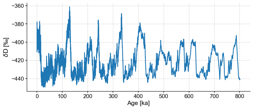
dD = pyleo.utils.load_dataset('EDC-dD')
dDts = dD.convert_time_unit('ky BP')
dDts.plot()
(<Figure size 1000x400 with 1 Axes>,
 <Axes: xlabel='Age [ka]', ylabel='$\\delta \\mathrm{D}$ [‰]'>)
dDts.metadata
{'lat': -75.1011,
 'lon': 123.3478,
 'elevation': 3233,
 'time_unit': 'ka',
 'time_name': 'Age',
 'value_unit': '‰',
 'value_name': '$\\delta \\mathrm{D}$',
 'label': 'EPICA Dome C dD',
 'archiveType': 'GlacierIce',
 'sensorType': 'ice sheet',
 'observationType': 'hydrogen isotopes',
 'importedFrom': 'https://www.ncei.noaa.gov/pub/data/paleo/icecore/antarctica/epica_domec/edc3deuttemp2007.txt',
 'control_archiveType': False,
 'log': None}
Notice that the series contains quite a bit of metadata (information about the data), and that this information is now being used by the code to properly label axes for you. Structuring and labeling your data is a little more work upfront, but it pays big dividends down the line. Let’s see that now.
First, take a look at the distribution of time increments:
dDts.resolution().dashboard()
(<Figure size 1100x800 with 2 Axes>,
 {'res': <Axes: xlabel='Age [ka]', ylabel='resolution [ka]'>,
  'res_hist': <Axes: xlabel='Counts'>})
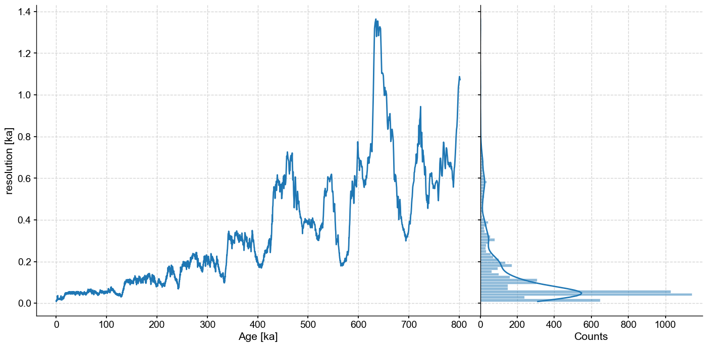
The data are not evenly spaced, which is a challenge because most timeseries analysis methods (particularly Fourier and wavelet analysis) make the implicit assumption that data are evenly spaced, so applying those tools to unevenly-spaced data will result in methods not behaving as they are supposed to. pyleoclim is one of very few packages to enable the Weighted-Wavelet Z transform of Foster (1996), which is designed for unevenly-spaced data. Unfortunately, and despite heroic feats of numerical optimization by its writer Feng Zhu, it can be very slow to run on large datasets, particularly when assessing significance with thousands of Monte Carlo simulations. We therefore interpolate the data at 500y resolution to enable the much faster CWT algorithm of Torrence & Compo (1998) to run. We also standardize because the original data range is rather large, which could cause numerical issues.
dD05 = dDts.interp(step=0.5).standardize()
Wavelet Analysis#
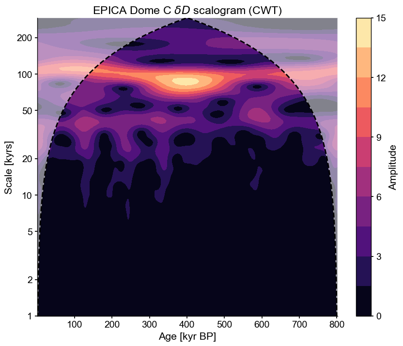
Wavelet analysis may be used to “unfold” a spectrum and look at its evolution over time. There are several ways to access that functionality in Pyleoclim, but here we use summary_plot(), which stacks together the timeseries itself, its scalogram (a plot of the magnitude of the wavelet power), and the power spectral density (PSD) obtained from summing the wavelet coefficients over time.
scal = dD05.wavelet()
scal.plot()
(<Figure size 1000x800 with 2 Axes>,
 <Axes: title={'center': 'EPICA Dome C $\\delta D$ scalogram (CWT)'}, xlabel='Age [kyr BP]', ylabel='Scale [kyrs]'>)
Customizing the frequency range#
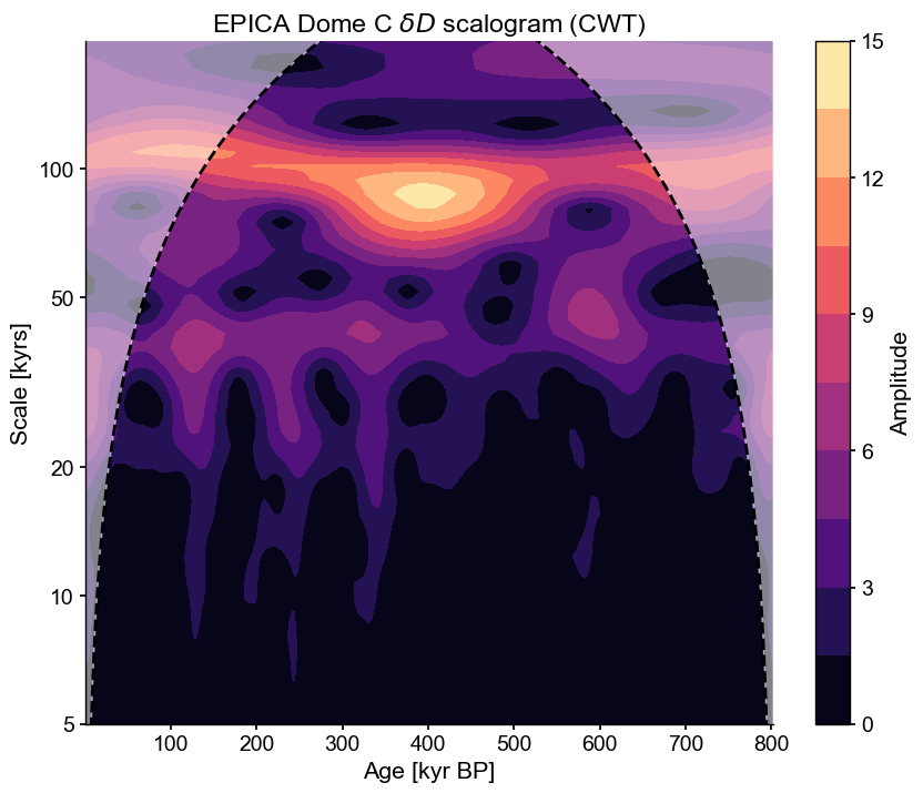
Given the uneven resolution, we might be justifiably skeptical of the ability of this record to track high-resolution fluctuations. Say we wanted to focus on oscillations in the 5-200kyr range. We can focus the analysis on this range, which will help highlight what we want, and also reduce computational expense:
scal_5_200 = dD05.wavelet(freq_kwargs={'fmin':1/200,'fmax':1/5,'nf':50})
scal_5_200.plot()
(<Figure size 1000x800 with 2 Axes>,
 <Axes: title={'center': 'EPICA Dome C $\\delta D$ scalogram (CWT)'}, xlabel='Age [kyr BP]', ylabel='Scale [kyrs]'>)
Alternatively, one could make a custom frequency vector using NumPy and pass it directly to the method:
freq = np.logspace(np.log2(1/200),np.log2(1/5),num=60, base=2)
scal_5_200 = dD05.wavelet(freq=freq)
scal_5_200.plot()
(<Figure size 1000x800 with 2 Axes>,
 <Axes: title={'center': 'EPICA Dome C $\\delta D$ scalogram (CWT)'}, xlabel='Age [kyr BP]', ylabel='Scale [kyrs]'>)

Significance Testing#
The scalogram reveals how spectral power (technically, wavelet power) changes over time. But which aspects of this are significant? There are two ways to test this in pyleoclim, both using an AR(1) benchmark. The first uses a parametric, asymptotic form of the theoretical spectrum of an AR(1) process:
scal_sig = scal_5_200.signif_test(method='ar1asym')
scal_sig.plot()
(<Figure size 1000x800 with 2 Axes>,
 <Axes: title={'center': 'EPICA Dome C $\\delta D$ scalogram (CWT) with 95% threshold'}, xlabel='Age [kyr BP]', ylabel='Scale [kyrs]'>)
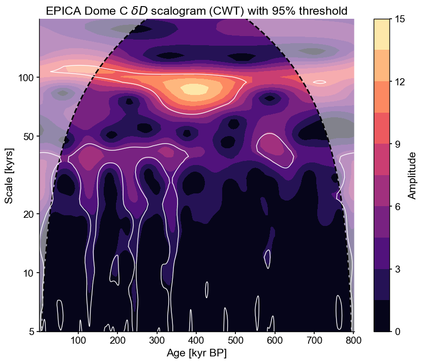
The white lines delineate regions of the scalogram that are significant against an AR(1) benchmark, thus encircling “islands” of notable power. We see that the 100kyr periodicity is particularly pronounced around 300-600 kyr BP, while the 40 and 20kyr periodicities are more pronounced in the later portions (since 400 ky BP). This may be because of the compaction of the ice at depth, which you wouldn’t know from analyzing just this dataset. Paleoclimate timeseries must always be interpreted with those possible artifacts in mind. There are a lot of significant islands at short (<10ky) scales as well, but it is unclear whether this is reflective of large-scale climate variability.
Now, notice that we specified the method ar1asym for the asssessment of significance; this tells the code to use an asymptotic approximation to the distribution of the AR(1) benchmarks, making it lightning-fast. We could also have used direct simulation (the default method, because it applies to other wavelet methods like wwz), and indeed this would yield a very similar result:
scal_sig2 = scal_5_200.signif_test(method='ar1sim', number = 1000)
scal_sig2.plot()
Performing wavelet analysis on individual series: 100%|██████████| 1000/1000 [00:27<00:00, 36.97it/s]
(<Figure size 1000x800 with 2 Axes>,
 <Axes: title={'center': 'EPICA Dome C $\\delta D$ scalogram (CWT) with 95% threshold'}, xlabel='Age [kyr BP]', ylabel='Scale [kyrs]'>)

However, an AR(1) benchmark (whether analytical or simulated) may not be the most appropriate here, as the spectrum appears to show scaling behavior (i.e. its spectrum can be reasonably approximated by a power law \(f^{-\beta}\), which will show up as a straight line in log-log space):
psd = dDts.spectral(method='wwz')
OMP: Info #276: omp_set_nested routine deprecated, please use omp_set_max_active_levels instead.
psd.beta_est().plot()
(<Figure size 1000x400 with 1 Axes>,
 <Axes: xlabel='Period [kyr]', ylabel='PSD'>)
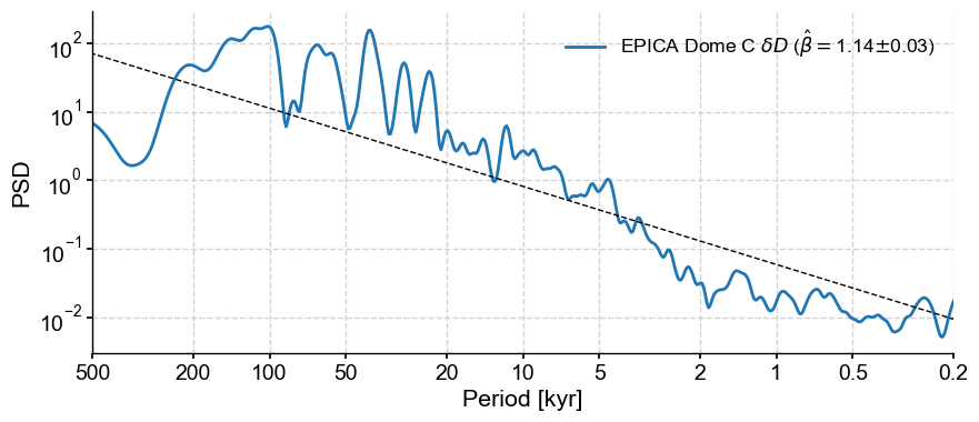
Indeed, a colored noise benchmark would be more appropriate here. Here is how you would invoke it:
scal_sig3 = scal_5_200.signif_test(method='CN', number = 1000)
scal_sig3.plot()
Performing wavelet analysis on individual series: 100%|██████████| 1000/1000 [00:28<00:00, 34.81it/s]
(<Figure size 1000x800 with 2 Axes>,
 <Axes: title={'center': 'EPICA Dome C $\\delta D$ scalogram (CWT) with 95% threshold'}, xlabel='Age [kyr BP]', ylabel='Scale [kyrs]'>)
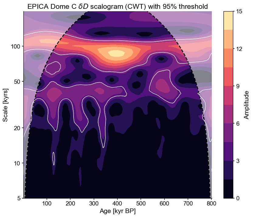
Differences are minor, but this benchmark tends to show scales shorter than 20ky as insignificant, and the 80-120ky band is significant throughout the record, unlike in the AR(1) case. This is a reminder to always choose appropriate surrogates.
Temperature vs \(CO_2\)#
Data Wrangling#
Now let us load the \(CO_2\) composite from this and other neighboring sites around Antarctica:
url = 'ftp://ftp.ncdc.noaa.gov/pub/data/paleo/icecore/antarctica/antarctica2015co2composite.txt'
co2df = pd.read_csv(url,skiprows=137,sep='\t')
co2df.head()
| age_gas_calBP | co2_ppm | co2_1s_ppm | |
|---|---|---|---|
| 0 | -51.03 | 368.02 | 0.06 |
| 1 | -48.00 | 361.78 | 0.37 |
| 2 | -46.28 | 359.65 | 0.10 |
| 3 | -44.41 | 357.11 | 0.16 |
| 4 | -43.08 | 353.95 | 0.04 |
Note that Pandas does not always require the file to be on your local computer to load the data. In this case, we passed a simple URL. Let’s load it as a Series object with appropriate metadata:
co2ts = pyleo.Series(time=co2df['age_gas_calBP']/1000,
                     value= co2df['co2_ppm'],
                     time_name='Age',time_unit='kyr BP',
                     value_name = r'$CO_2$',value_unit='ppm',
                     label='EPICA Dome C CO2', verbose=False)
co2ts.plot(color='C1')
(<Figure size 1000x400 with 1 Axes>,
 <Axes: xlabel='Age [kyr BP]', ylabel='$CO_2$ [ppm]'>)
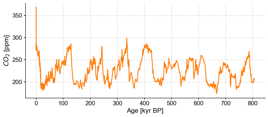
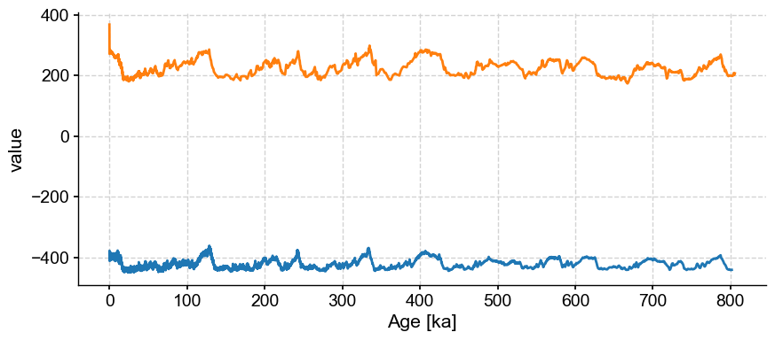
We see very similar Ice Ages as in the deuterium data, as well as a precipitous rise since the Industrial Revolution. To plot the two series side by side, we can put them into a MultipleSeries object and use that class’s default plot() function:
ms = pyleo.MultipleSeries([dDts,co2ts])
ms.plot()
(<Figure size 1000x400 with 1 Axes>, <Axes: xlabel='Age [ka]', ylabel='value'>)
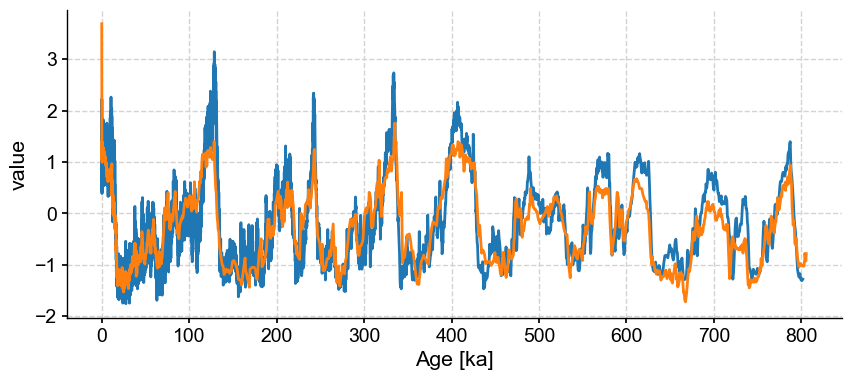
By default, the MultipleSeries class assumes commensurate units, which is not the case here. Fear not, we can simply standardize the series:
ms.standardize().plot()
(<Figure size 1000x400 with 1 Axes>, <Axes: xlabel='Age [ka]', ylabel='value'>)
Wavelet Coherence#
We seek to understand potential lead/lag relationships between those two series. Before that, a brief primer: the temperature proxy \(\delta D\) is measured on the ice, whereas \(CO_2\) is measured in the air trapped in the ice. Because bubbles close only progressively as the firn gets compacted, the air can be younger than the surrouding ice by several hundred years. The ice core community has worked diligently on this for decades and have made very clever adjustments to correct for this effect, but that is to be kept in mind when comparing those two data streams.
With that in mind, let us apply wavelet transform coherency to identify phase relationships between the two series at various scales:
coh = co2ts.wavelet_coherence(dDts,method='wwz')
fig, ax = coh.plot()
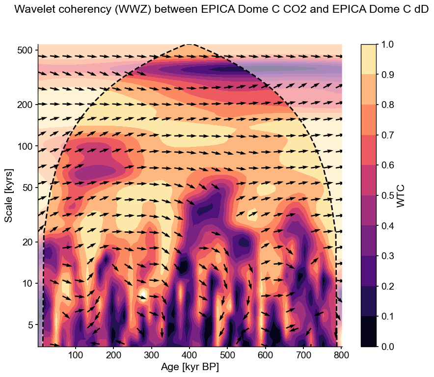
This plot shows two things:
the wavelet transform coherency (WTC), which may be thought of as a (squared) correlation coefficient in time-scale space: 0 if the series do not covary, 1 if they vary in perfect unison at that time and scale.
the phase angle between the two series, using a trigonometric convention (right = 0, top = 90 degrees, left = 180 degrees, bottom = -90 or + 270 degrees).
Arrows pointing to the right indicate a phase angle close to zero at all scales longer than precession. We can quantify that by computing the average phase angle in a given range of scales, like so:
coh.phase_stats(scales=[80,100])
Results(mean_angle=0.11337289763260268, kappa=22.001092896027867, sigma=0.21570904255129714, kappa_hi=391.62700755341325, sigma_lo=0.050563999674677694)
This means that on orbital timescales, the two series are essentially in phase ; there is no consistent lead or lag between the two series. This is remarkable given the dating challenges mentioned earlier, and is widely interpreted to mean that on such timescales, atmospheric \(CO_2\) is a part of a positive feedback loop amplifying orbitally-triggered changes in temperature. However, the variance of this angle is fairly high, and by this test it does not register as a very consistent signal. Lastly, note that in the anthropogenic era, atmospheric \(CO_2\) is of course a forcing (the largest climate forcing, currently), acting on much, much faster timescales for which the climate system is still catching up. You would not know it from this analysis, but it’s important to state out loud, given that climate deniers have an annoying tendency to cherry-pick the paleoclimate record in support of their feeble arguments.
One might be tempted to interpret phase angles at shorter scales. Let us first see if they are significant against AR(1) benchmarks. As before this can be done in one function call, though some patience is required to obtain the result.
coh_sig = coh.signif_test(method='CN',number=20)
Performing wavelet coherence on surrogate pairs: 100%|██████████| 100/100 [1:00:00<00:00, 36.01s/it]
fig, ax = coh_sig.plot()
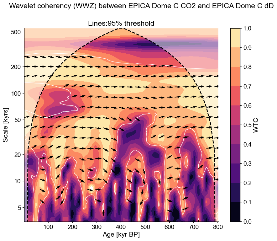
These phase differences are indeed significant according to this test, but mostly inconsistent (at a given scale, the arrows veer one way or the other). This would not be a good candidate for identifying a robust lead or lag. One would find the same result with phase_stats().
Another consideration is that coherency is like the correlation coefficient in wavelet space: it tells you how similar two series are for a given time and scale, yet it says nothing about what fraction of the total variability is shared. This is better measured by the cross-wavelet transform (XWT), which highlights areas of high common power. Both of those, along with the original series, can be visualized with one swift function call:
coh_sig.dashboard()
(<Figure size 900x1200 with 6 Axes>,
 {'ts1': <Axes: ylabel='$CO_2$ [ppm]'>,
  'ts2': <Axes: xlabel='Age [ka]', ylabel='$\\delta \\mathrm{D}$ [‰]'>,
  'wtc': <Axes: ylabel='Scale [kyrs]'>,
  'xwt': <Axes: xlabel='Age [kyr BP]', ylabel='Scale [kyrs]'>})
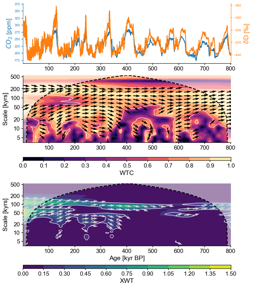
Here we see that the orbital bands are the only ones to show up consistently throughout the record, but precession and obliquity fade before 200 ky BP in their common power, and the XWT band near 120 ka drifts to 80ka back in time. This means that, out of the large swathes of WTC one would consider “coherent”, only those areas highlighted in XWT in green-yellow are likely important. That’s where we stop the banter, though: when you are getting down to that level, you had better be a glaciologist, or talk to one about what is going on in those datasets.
Takeways#
Pyleoclimenables wavelet and wavelet coherence analysis.evenly-spaced data are handled with the CWT algorithm of Torrence & Compo (1998), which is very fast; unevenly-spaced data are handled through the WWZ algorithm of Foster (1996), which is slow. The temptation to interpolate is strong, but it has downsides. WWZ should be preferred, though CWT+interpolation can be used at exploratory stages.
Both Scalogram and Coherence objects have a built-in
signif_test()method, which theplot()method will know what to do with.Wavelet Transform Coherency may be thought of as a (squared) correlation coefficient in time-scale space: 0 if the series do not covary, 1 if they vary in perfect unison at that time and scale.
Properly interpreting the results of wavelet and wavelet coherence analyses requires knowing something about the methods.
%watermark -n -u -v -iv -w
Last updated: Mon Jun 17 2024

Python implementation: CPython
Python version       : 3.11.9
IPython version      : 8.25.0

numpy     : 1.26.4
matplotlib: 3.9.0
pyleoclim : 1.0.0
pandas    : 2.1.4

Watermark: 2.4.3