
Working with Pandas#
Preamble#
Pandas is part of nearly every data scientist’s toolkit, with robust support for spreadsheet-like data structures. Until 2023, however, this workhorse of time series analysis was unusable in the paleogeosciences, because Pandas long ago hardcoded nanoseconds as the base unit of time. This limited the timescales it can represent on a 64-bit machine to a relatively narrow timespan of 585 years, thus excluding many paleogeoscience applications (for more explanations, see this blog post). In this notebook we explore the synergies between pandas and Pyleoclim.
Goals:#
Learn to export Pyleclim
Seriesto PandasSeries.Unit conversions
Select portions of a time series based on time or value criteria
Export/Import to csv file
Resampling in time
Handling
MultipleSerieswith Pandas
Reading time#
10 minutes
Keywords#
Pandas; Time Units; Resampling in time; Selection
Pre-Requisites#
Knoweldge of Pyleoclim Series and MultipleSeries objects. Familiarity with Pandas.
Relevant Packages#
Pandas
Data Description#
Sea-surface temperature from Kaplan (1998) averaged over the NINO3 (5N-5S, 150W-190E)) region.
Bereiter, B., Eggleston, S., Schmitt, J., Nehrbass-Ahles, C., Stocker, T. F., Fischer, H., … Chappellaz, J. (2015). Revision of the EPICA Dome C CO2 record from 800 to 600 kyr before present. Geophysical Research Letters, 42(2), 542–549. doi:10.1002/2014gl061957
Demonstration#
%load_ext watermark
import warnings
warnings.filterwarnings('ignore')
import pandas as pd
import numpy as np
import seaborn as sns
import matplotlib.pyplot as plt

import pyleoclim as pyleo
pd.__version__
'3.0.1'
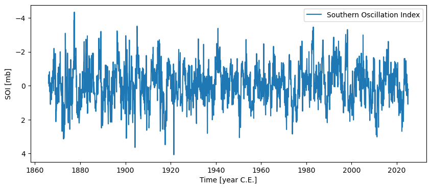
Let’s load the SOI timeseries:
soi = pyleo.utils.load_dataset('SOI')
soi.plot(invert_yaxis=True) # invert y axis so El Niño events plot upward
(<Figure size 1000x400 with 1 Axes>,
 <Axes: xlabel='Time [year C.E.]', ylabel='SOI [mb]'>)
There are two properties attached to pyleo.Series objecsoi:
a Pandas datetime_index:
soi.datetime_index
DatetimeIndex(['1866-01-01', '1866-02-01', '1866-03-01', '1866-04-01',
               '1866-05-01', '1866-06-01', '1866-07-01', '1866-08-01',
               '1866-09-01', '1866-10-01',
               ...
               '2024-05-01', '2024-06-01', '2024-07-01', '2024-08-01',
               '2024-09-01', '2024-10-01', '2024-11-01', '2024-12-01',
               '2025-01-01', '2025-02-01'],
              dtype='datetime64[s]', name='datetime', length=1910, freq=None)
a dictionary bundling all the metadata:
soi.metadata
{'time_unit': 'year C.E.',
 'time_name': 'Time',
 'value_unit': 'mb',
 'value_name': 'SOI',
 'label': 'Southern Oscillation Index',
 'archiveType': 'Instrumental',
 'importedFrom': None,
 'log': None}
Invoking the object itself returns some essential metadata and a compressed view of the data.
soi
{'archiveType': 'Instrumental', 'label': 'Southern Oscillation Index'}
None
Time [year C.E.]
1866.002894   -0.62
1866.087769   -0.12
1866.164431   -0.62
1866.249306   -0.65
1866.331443    0.04
               ...
2024.752349    0.35
2024.837224    0.61
2024.919362    1.09
2025.004237    0.26
2025.089112    0.21
Name: SOI [mb], Length: 1910, dtype: float64
For a prettier display (in Jupyter notebook only):
soi.view()
| SOI [mb] | |
|---|---|
| Time [year C.E.] | |
| 1866.002894 | -0.62 |
| 1866.087769 | -0.12 |
| 1866.164431 | -0.62 |
| 1866.249306 | -0.65 |
| 1866.331443 | 0.04 |
| ... | ... |
| 2024.752349 | 0.35 |
| 2024.837224 | 0.61 |
| 2024.919362 | 1.09 |
| 2025.004237 | 0.26 |
| 2025.089112 | 0.21 |
1910 rows × 1 columns
.to_pandas()#
It is easy to export a Pyleoclim Series to a Pandas Series:
pdts = soi.to_pandas() #  returns just the Series ; metadata are available at soi.metadata
type(pdts)
pandas.Series
It is now a bona fide Pandas Series, and we can do with it everything we might do with Pandas. For example:
pdts.head()
datetime
1866-01-01   -0.62
1866-02-01   -0.12
1866-03-01   -0.62
1866-04-01   -0.65
1866-05-01    0.04
Name: SOI, dtype: float64
Or this:
pdts.describe()
count    1910.000000
mean       -0.045236
std         1.130175
min        -4.340000
25%        -0.780000
50%        -0.020000
75%         0.740000
max         4.070000
Name: SOI, dtype: float64
Because Pyleoclim now has Pandas under the hood, one can now apply any Pandas method to a Pyleoclim Series, via a lambda function. For instance, applying an exponential transform to the data:
soi.pandas_method(lambda x: x.transform(np.exp))
{'archiveType': 'Instrumental', 'label': 'Southern Oscillation Index'}
None
Time [year C.E.]
1866.002894    0.537944
1866.087769    0.886920
1866.164431    0.537944
1866.249306    0.522046
1866.331443    1.040811
                 ...
2024.752349    1.419068
2024.837224    1.840431
2024.919362    2.974274
2025.004237    1.296930
2025.089112    1.233678
Name: SOI [mb], Length: 1910, dtype: float64
For more examples, see this page
Unit conversions#
Pyleoclim now comprehends datestring semantics, which enable enhanced conversions betwen time representations. For instance, converting the SOI series to years before 1950 (“BP”):
soiBP = soi.convert_time_unit('yrs BP')
fig, ax = soiBP.plot(invert_yaxis=True) # by default, plots represent values in increasing order, so we reverse the x-axis
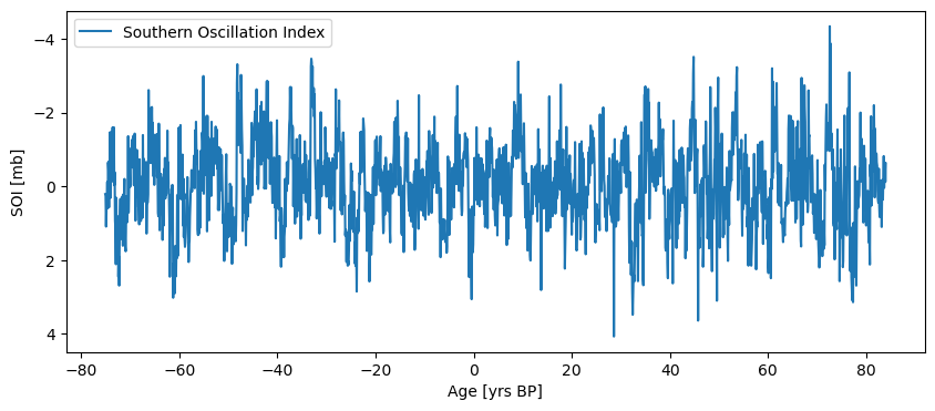
The Series plots from recent to old, because the Matplotlib plot() function always works with increasing values. However, it is easy to check that it was indeed flipped:
soiBP.view()
| SOI [mb] | |
|---|---|
| Age [yrs BP] | |
| -75.087162 | 0.21 |
| -75.002286 | 0.26 |
| -74.917411 | 1.09 |
| -74.835274 | 0.61 |
| -74.750399 | 0.35 |
| ... | ... |
| 83.670507 | 0.04 |
| 83.752644 | -0.65 |
| 83.837520 | -0.62 |
| 83.914181 | -0.12 |
| 83.999056 | -0.62 |
1910 rows × 1 columns
The index has been flipped as well:
soiBP.datetime_index
DatetimeIndex(['2025-02-01 00:00:00', '2025-01-01 00:00:00',
               '2024-12-01 00:00:00', '2024-11-01 00:00:00',
               '2024-10-01 00:00:00', '2024-09-01 00:00:00',
               '2024-08-01 00:00:00', '2024-07-01 00:00:00',
               '2024-06-01 00:00:00', '2024-05-01 00:00:00',
               ...
               '1866-10-01 00:00:00', '1866-09-01 00:00:00',
               '1866-08-01 00:00:00', '1866-07-01 00:00:00',
               '1866-06-01 00:00:00', '1866-05-01 00:00:00',
               '1866-04-01 00:00:00', '1866-03-01 00:00:00',
               '1866-02-01 00:00:00', '1866-01-01 00:00:00'],
              dtype='datetime64[s]', name='datetime', length=1910, freq=None)
If we wanted to preserve the original time flow (old to recent) in a plot, all you’d have to do is use the invert_xaxis parameter:
soiBP.plot(invert_yaxis=True, invert_xaxis=True, label = 'SOI, years BP', color='C1')
(<Figure size 1000x400 with 1 Axes>,
 <Axes: xlabel='Age [yrs BP]', ylabel='SOI [mb]'>)
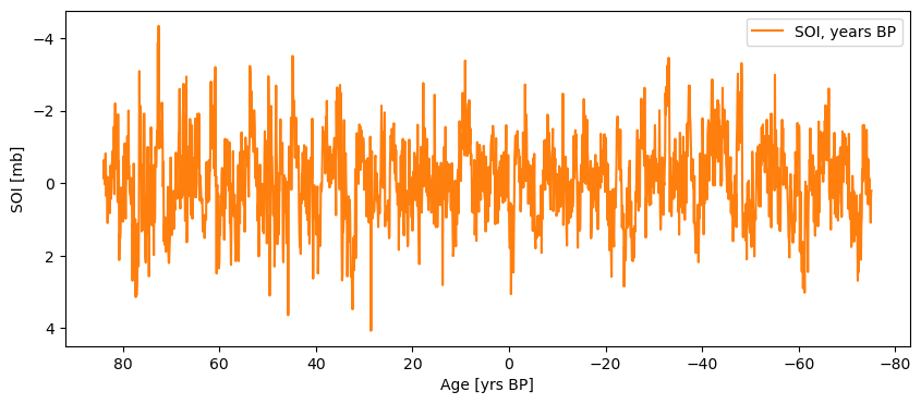
(this is an admittedly contrived example, as no one in their right mind would cast instrumental series in years BP).
Selection#
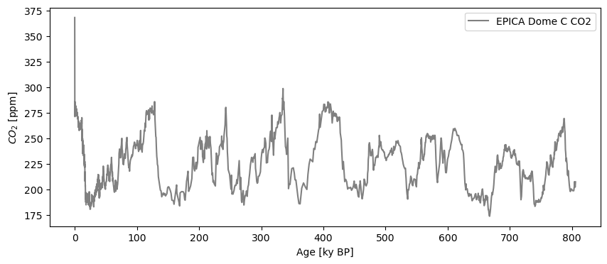
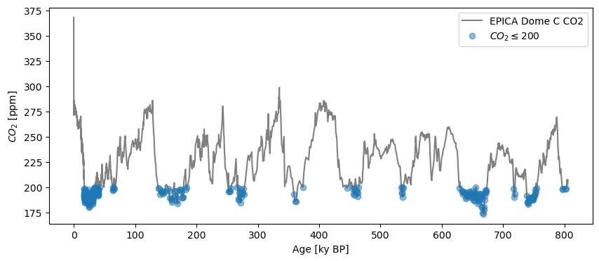
Let’s load a true paleoclimate example, the Dome C \(CO_2\) composite, and use Pandas semantics to select particular values.
co2ts = pyleo.utils.load_dataset('AACO2')
co2ts.plot(color='gray')
(<Figure size 1000x400 with 1 Axes>,
 <Axes: xlabel='Age [ky BP]', ylabel='$CO_2$ [ppm]'>)
co2ts.metadata
{'time_unit': 'ky BP',
 'time_name': 'Age',
 'value_unit': 'ppm',
 'value_name': '$CO_2$',
 'label': 'EPICA Dome C CO2',
 'archiveType': 'GlacierIce',
 'importedFrom': 'https://www.ncei.noaa.gov/pub/data/paleo/icecore/antarctica/antarctica2015co2composite.txt',
 'log': None}
co2ts.view()
| $CO_2$ [ppm] | |
|---|---|
| Age [ky BP] | |
| -0.05103 | 368.02 |
| -0.04800 | 361.78 |
| -0.04628 | 359.65 |
| -0.04441 | 357.11 |
| -0.04308 | 353.95 |
| ... | ... |
| 803.92528 | 202.92 |
| 804.00987 | 207.50 |
| 804.52267 | 204.86 |
| 805.13244 | 202.23 |
| 805.66887 | 207.29 |
1901 rows × 1 columns
To select a particular interval, (say the Eemian, 115 to 130 ky BP), you can use sel:
co2_ee = co2ts.sel(time=slice(115,130))
co2_ee.plot(marker='o', color='gray')
(<Figure size 1000x400 with 1 Axes>,
 <Axes: xlabel='Age [ky BP]', ylabel='$CO_2$ [ppm]'>)
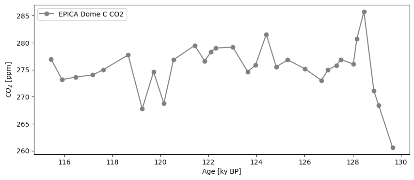
If you wanted to extract the time of the maximum value, an easy approach is to use sel again:
co2_ee.sel(value=co2_ee.value.max()).view()
| $CO_2$ [ppm] | |
|---|---|
| Age [ky BP] | |
| 128.46673 | 285.76 |
We zero-ed in on the value ~128.5 ky BP as the highest \(CO_2\) concentration in the Eemian. Note that the result is still a Series object (in this case, a very short one!). Similarly, to identify the timing of glacial maxima by values below 200 ppm, one could select with an open interval:
co2_G = co2ts.sel(value=slice(None,200)) # returns a new Series object
fig, ax = co2ts.plot(color='gray')
co2_G.plot(marker='o',linewidth=0,alpha= 0.5, ax=ax,label=r"$CO_2\leq200$")
<Axes: xlabel='Age [ky BP]', ylabel='$CO_2$ [ppm]'>
For interglacials, select half-open intervals the other way:
co2_IG = co2ts.sel(value=slice(270,None)) # returns a new Series object
fig, ax = co2ts.plot(color='gray')
co2_G.plot(marker='o',linewidth=0,alpha= 0.5, ax=ax,label=r"$CO_2\leq200$")
co2_IG.plot(marker='o',linewidth=0, color = 'C3', alpha= 0.5, ax=ax,label=r"$CO_2\geq270$")
<Axes: xlabel='Age [ky BP]', ylabel='$CO_2$ [ppm]'>
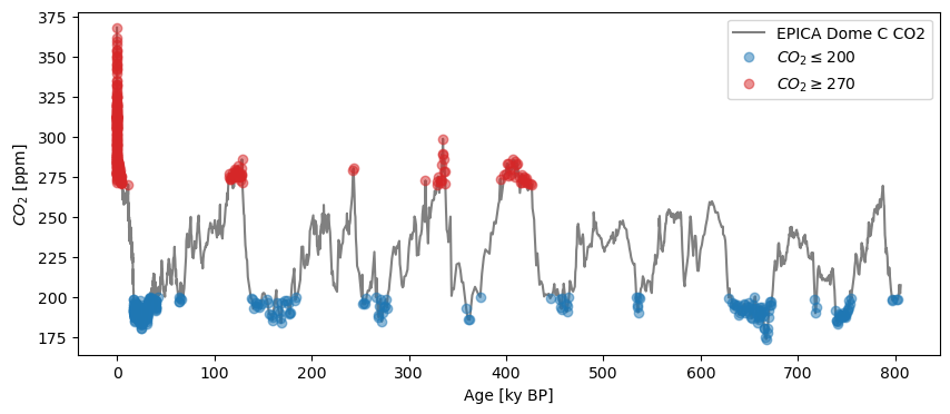
Again, both of these are Series objects, albeit highly discontinuous ones.
Science Remark: admittedly, an absolute threshold for defining interglacials makes little sense. A smarter way would be to use clustering, as implemented in the outliers() method and a dedicated tutorial.
CSV Import/Export#
Pandas integration allows a very easy round trip with CSV files:
Exporting to CSV#
filename = '../data/EPICA_Dome_C_CO2.csv'
co2ts.to_csv(path = filename)
Series exported to ../data/EPICA_Dome_C_CO2.csv
The path name is optional; if no file name is provided (as is the case here), the file is named after the Series label. This is another reason to choose meaningful and relatively concise labels!
Importing from CSV#
Read the file back in and gives the same Series:
co2ts2 = pyleo.Series.from_csv(path='../data/EPICA_Dome_C_CO2.csv')
co2ts2.equals(co2ts)
Time axis values sorted in ascending order
(True, True)
Note the use of the equals() method, inspired the eponymous method from Pandas. The Pyleoclim implementation returns two boolean objects: the first says whether the two Pandas Series are the same; the second whether the metadata are the same. Fortunately, we landed back on our feet.
Resampling#
One of Pandas’ most powerful capabilities is resampling() series to attain various temporal resolutions. Pyleoclim implements a function of the same name, but using normal “paleo-speak” to define resolution. For instance, let’s coarse-grain on 5,000 year intervals:
co2_5k = co2ts.resample('5ka')
type(co2_5k)
pyleoclim.core.series.SeriesResampler
The output of this function is a variant on a Pandas resampler; the values then need to be aggregated or transformed. For our purpose, let’s average them over those 5ky bins:
co2_5kavg = co2_5k.mean() # the aggregator here is simply the mean
fig, ax = co2ts.plot(color='gray')
co2_5kavg.plot(ax=ax,color='C1')
<Axes: xlabel='Age [ky BP]', ylabel='$CO_2$ [ppm]'>
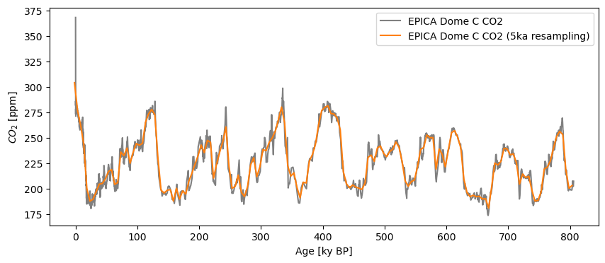
One notable distinction to standard Pandas resampling is that Pyleoclim aligns the resampled index to the midpoint of each interval, to minimize age offsets. In contrast, Pandas aligns to the beginning of an interval.
In terms of nomenclature, resample() can understand several abbreviations for “kiloyear”, such as ‘ka’, ‘ky’, or ‘kyrs’. In fact, these would work:
pyleo.utils.tsbase.MATCH_KA
frozenset({'ka', 'kiloyear', 'kiloyr', 'kiloyrs', 'ky', 'kyr', 'kyrs'})
For millions of years, use:
pyleo.utils.tsbase.MATCH_MA
frozenset({'ma', 'my', 'myr', 'myrs'})
and so on for other multiples, like years (pyleo.utils.tsbase.MATCH_A) or billion years (pyleo.utils.tsbase.MATCH_GA)
Further, the Resampler class allows one to choose statistics other than the mean, e.g., a running standard deviation:
co2_5k.std().view()
| $CO_2$ [ppm] | |
|---|---|
| Age [ky BP] | |
| -1.831006 | 21.187646 |
| 3.169000 | 4.424875 |
| 8.169003 | 2.471905 |
| 13.169008 | 12.374541 |
| 18.169011 | 13.381836 |
| ... | ... |
| 783.169643 | 3.247548 |
| 788.169646 | 15.221735 |
| 793.169651 | 8.006723 |
| 798.169654 | 2.977565 |
| 803.169660 | 3.386011 |
162 rows × 1 columns
Pandas operations with MultipleSeries objects#
Let’s load the Deuterium EPICA DOME C record:
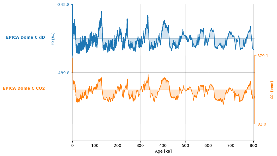
edc = pyleo.utils.load_dataset('EDC-dD')
We then create a MultipleSeries object using the & shorthand:
ms =  edc.convert_time_unit("ky BP") & co2ts
type(ms)
pyleoclim.core.multipleseries.MultipleSeries
ms.stackplot()
(<Figure size 640x480 with 3 Axes>,
 {0: <Axes: ylabel='$\\delta \\mathrm{D}$ [‰]'>,
  1: <Axes: ylabel='$CO_2$ [ppm]'>,
  'x_axis': <Axes: xlabel='Age [ka]'>})
Exporting to pandas#
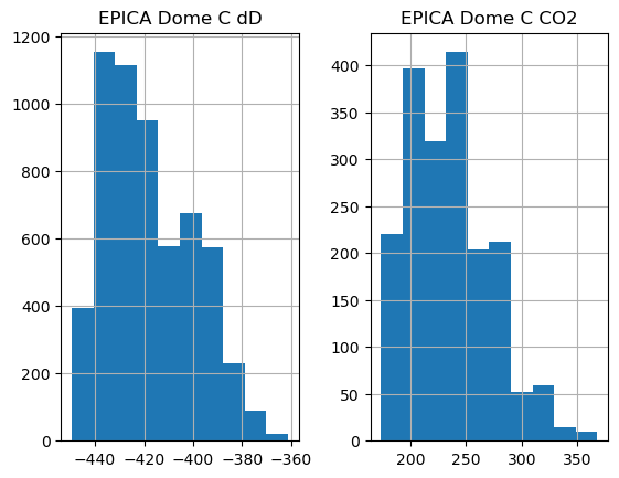
The MultipleSeries class also has a to_pandas() method; this one exports to a dataframe:
df = ms.to_pandas()
df.head()
| EPICA Dome C dD | EPICA Dome C CO2 | |
|---|---|---|
| datetime | ||
| -803719-10-17 10:22:57 | NaN | 207.29 |
| -803182-03-23 07:19:38 | NaN | 202.23 |
| -802573-12-30 00:58:49 | NaN | 204.86 |
| -802060-10-17 05:46:09 | NaN | 207.50 |
| -801975-05-20 01:52:17 | NaN | 202.92 |
By default, to_pandas() exports the Series as they are, and one can see that the values are not aligned. Some plotting functions still work out of the proverbial box:
df.hist()
array([[<Axes: title={'center': 'EPICA Dome C dD'}>,
        <Axes: title={'center': 'EPICA Dome C CO2'}>]], dtype=object)
Alas, df.plot() wouldn’t work on this long series, as Matplotlib assumes dates must be between year 0001 and 9999.
As with Series, ms.to_csv() will export the object to a CSV file. We skip this here, as the output is not very graphical.
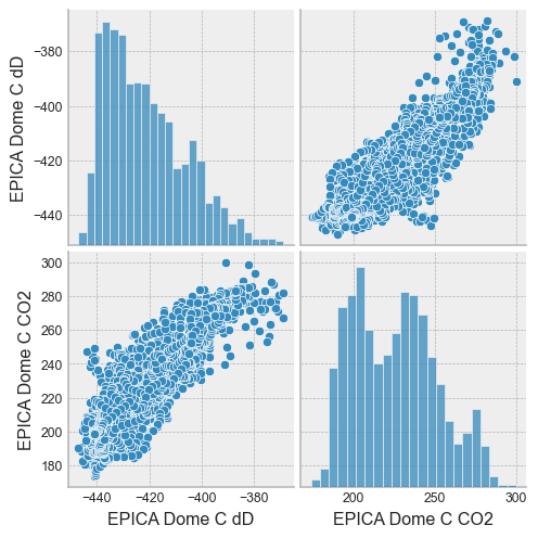
Aligning to a common axis#
In many instances it is useful for the Series to share a common time axis. This can be done simply this way:
df = ms.to_pandas(use_common_time=True)
df.head()
| EPICA Dome C dD | EPICA Dome C CO2 | |
|---|---|---|
| datetime | ||
| 1911-08-18 06:32:30 | -390.900000 | 299.817617 |
| 1630-04-19 08:12:23 | -400.382865 | 274.220786 |
| 1348-12-20 09:52:15 | -401.167982 | 278.367365 |
| 1067-08-23 11:32:07 | -398.662864 | 282.612398 |
| 786-04-25 13:11:59 | -396.520050 | 279.625252 |
Seaborn is a plotting library designed to visualize DataFrames. With just one line, it is easy to get an overview of the data with a pairplot:
sns.set(font_scale=0.8)
with plt.style.context('bmh'):
    sns.pairplot(df)
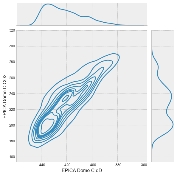
or a jointplot:
with plt.style.context('bmh'):
    sns.jointplot(data=df,kind='kde', x='EPICA Dome C dD', y='EPICA Dome C CO2')
Summary#
The legendary pandas library is fully integrated within Pyleoclim. This opens the door to many powerful, user-friendly functionatlities for data processing and visualization. For other examples of how pandas is making life easier in Pyleoclim, see this notebook; however, the real frontier is what you will decide to do with it. Possibilities abound!
%watermark -n -u -v -iv -w
Last updated: Thu, 12 Mar 2026

Python implementation: CPython
Python version       : 3.12.13
IPython version      : 9.10.0

IPython   : 9.10.0
json      : 2.0.9
matplotlib: 3.10.8
numpy     : 2.4.2
pandas    : 3.0.1
pyleoclim : 1.3.1b0
seaborn   : 0.13.2

Watermark: 2.6.0