5.3 Data cleaning
5.3.1 Aggregate to monthly
discharge_monthly <- df |>
  group_by(Date = floor_date(ymd(df$datetime), '1 month')) |>
  summarise(discharge = mean(`discharge (cf/s)`, na.rm = TRUE), .groups = 'drop')


ggplot(discharge_monthly, aes(x=Date, y=discharge)) +
  labs(title = "Rio Grande at Embudo, NM (monthly)",
       x="Year (CE)",
       y="dicharge (cf/s)") +
  geom_line() +
  ggtitle("Rio Grand Discharge") +
  theme_light()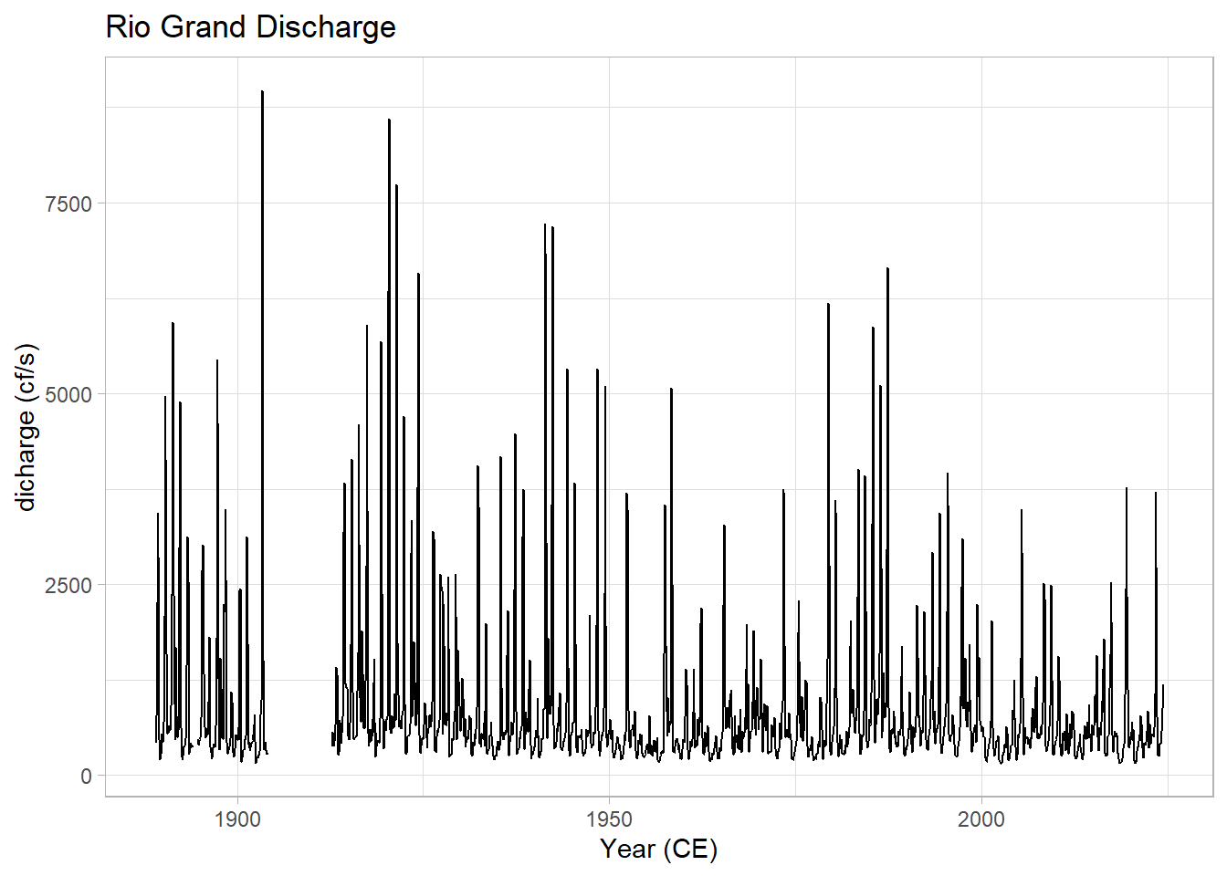
5.3.2 Even sampling
##   [1] "1894-03-01" "1894-04-01" "1894-05-01" "1894-06-01" "1894-07-01" "1894-08-01"
##   [7] "1894-09-01" "1904-04-01" "1904-05-01" "1904-06-01" "1904-07-01" "1904-08-01"
##  [13] "1904-09-01" "1904-10-01" "1904-11-01" "1904-12-01" "1905-01-01" "1905-02-01"
##  [19] "1905-03-01" "1905-04-01" "1905-05-01" "1905-06-01" "1905-07-01" "1905-08-01"
##  [25] "1905-09-01" "1905-10-01" "1905-11-01" "1905-12-01" "1906-01-01" "1906-02-01"
##  [31] "1906-03-01" "1906-04-01" "1906-05-01" "1906-06-01" "1906-07-01" "1906-08-01"
##  [37] "1906-09-01" "1906-10-01" "1906-11-01" "1906-12-01" "1907-01-01" "1907-02-01"
##  [43] "1907-03-01" "1907-04-01" "1907-05-01" "1907-06-01" "1907-07-01" "1907-08-01"
##  [49] "1907-09-01" "1907-10-01" "1907-11-01" "1907-12-01" "1908-01-01" "1908-02-01"
##  [55] "1908-03-01" "1908-04-01" "1908-05-01" "1908-06-01" "1908-07-01" "1908-08-01"
##  [61] "1908-09-01" "1908-10-01" "1908-11-01" "1908-12-01" "1909-01-01" "1909-02-01"
##  [67] "1909-03-01" "1909-04-01" "1909-05-01" "1909-06-01" "1909-07-01" "1909-08-01"
##  [73] "1909-09-01" "1909-10-01" "1909-11-01" "1909-12-01" "1910-01-01" "1910-02-01"
##  [79] "1910-03-01" "1910-04-01" "1910-05-01" "1910-06-01" "1910-07-01" "1910-08-01"
##  [85] "1910-09-01" "1910-10-01" "1910-11-01" "1910-12-01" "1911-01-01" "1911-02-01"
##  [91] "1911-03-01" "1911-04-01" "1911-05-01" "1911-06-01" "1911-07-01" "1911-08-01"
##  [97] "1911-09-01" "1911-10-01" "1911-11-01" "1911-12-01" "1912-01-01" "1912-02-01"
## [103] "1912-03-01" "1912-04-01" "1912-05-01" "1912-06-01" "1912-07-01" "1912-08-01"
df3 <- discharge_monthly |>
dplyr::filter(Date > max(missing_vals))
hist(as.numeric(diff(df3$Date)),main = "Distribution of Time Steps", xlab = "Days")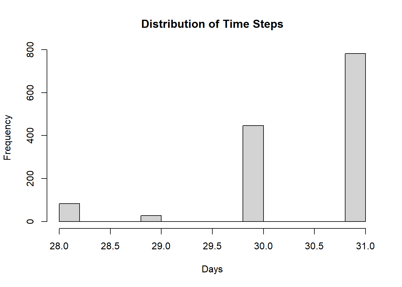
df4 <- df3 |>
  mutate(Date = decimal_date(Date)) |>
  astrochron::linterp(dt=(1/12),genplot = F) |>
  dplyr::filter(Date > max(missing_vals))
##
## ----- APPLYING PIECEWISE-LINEAR INTERPOLATION TO STRATIGRAPHIC SERIES -----
##
## * Number of samples= 1341
## * New number of samples= 1340ggplot(df4, aes(x=Date, y=discharge)) +
labs(title = "Rio Grande at Embudo, NM (30.4375-day period)",
x="Year (CE)",
y="dicharge (cf/s)") +
geom_line() +
theme_light()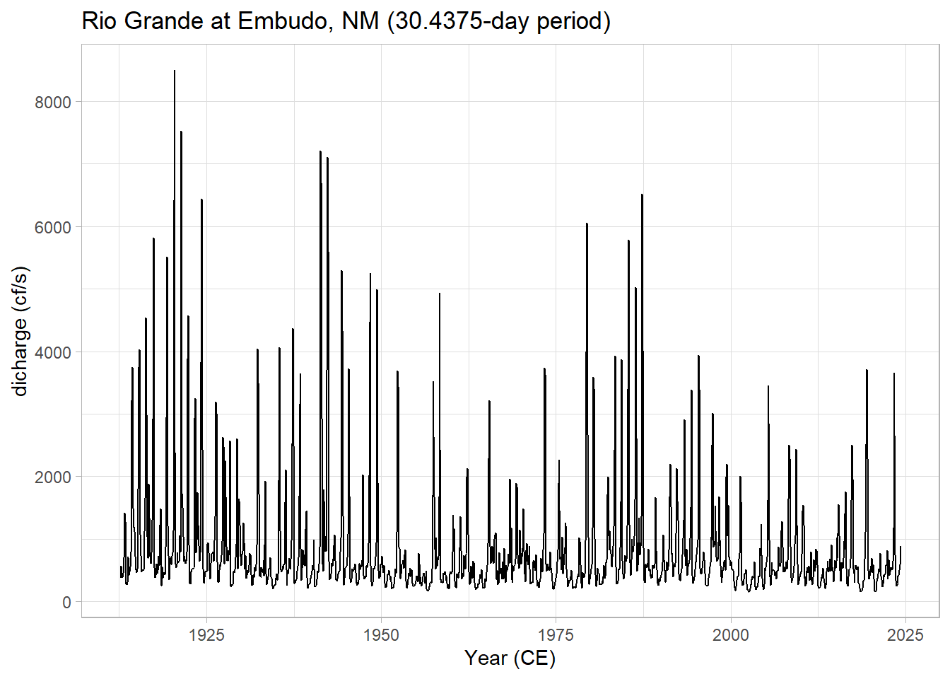
5.3.3 Spectral analysis
5.3.3.1 multi-taper
mtm1 <- mtm(df4,output = 1,verbose = F) |>
  mutate(Period = 1/Frequency,
                  Power = Power/1000) |> #account for differing units in astrochrons MTM
  dplyr::select(Period, Power)
reverselog_trans <- function(base = exp(1)) {
trans <- function(x) -log(x, base)
inv <- function(x) base^(-x)
trans_new(paste0("reverselog-", format(base)), trans, inv,
log_breaks(base = base),
domain = c(1e-100, Inf))
}
ggplot(mtm1, aes(x=Period, y=Power)) +
labs(title = "Rio Grande discharge spectrum (mtm)") +
geom_line() +
scale_y_log10() +
scale_x_continuous(trans = reverselog_trans(10),
breaks = c(100,50,20,10,5,2,1,0.5,0.2),
limits = c(100,0.2)) +
theme_light()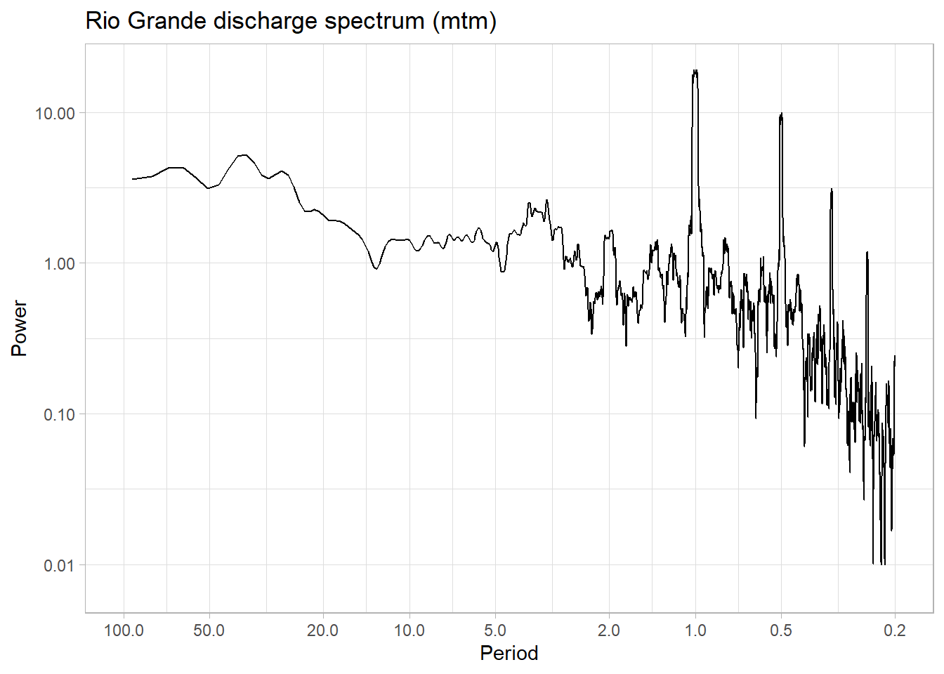 The prominent feature is a strong annual cycle and higher-order harmonics, super-imposed on a “warm colored” background (i.e. variations at long timescales are larger than variations at short timescales). There are hints of long-term scaling as well, one in the subannual range, and one from period of 1 to 50y. We may be interested in the shape of this background, and whether it can be fit by one or more power laws.
In addition, we may be interested in interannual (year-to-year) to interdecadal (decade-to-decade) variations in streamflow. We would like to know whether the peak observed around 3-4 years in the plot above is significant with respect to a reasonable null.
5.3.4 STL
To do both of these things it would make sense to remove the annual cycle. We’ll use STL decomposition for this.
5.3.4.1 Gaussianize
Now, because of the positive skew mentioned above, it turns out that the STL decomposition has trouble with this dataset. Instead, we can use the gaussianize() to map this dataset to a standard normal. There are applications for which this would be undesirable, but for this purpose it is good:
Gaussianize is available as part of the geoChronR package - but it’s also pretty simple, so let’s just define that here:
5.3.4.2 MTM, again
Let’s take a look at how this affects the spectrum:
df5 <- df4 |>
  mutate(discharge = gaussianize(discharge))


mtm2 <-   mtm(df5,output = 1,verbose = F) |>
  mutate(Period = 1/Frequency, #Calculate frequency
         Power = Power/1000, #account for differing units in astrochrons MTM
        AR1_95_power = AR1_95_power/1000) |>  #account for differing units in astrochrons MTM
  dplyr::select(Period, Power)
ggplot(mtm2, aes(x=Period, y=Power)) +
  labs(title = "Rio Grande discharge spectrum (mtm)") +
  geom_line() +
  scale_y_log10() +
  scale_x_continuous(trans = reverselog_trans(10),
                     breaks = c(100,50,20,10,5,2,1,0.5,0.2),
                     limits = c(100,0.2)) +
  theme_light()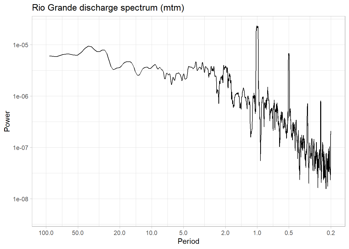
5.3.4.3 Applying STL
We see that the spectrum is nearly unchanged, but now we can apply STL:
dis <- ts(as.numeric(df5$discharge), start = c(1889, 1), frequency = 12)
stl_res <- stl(dis, s.window = "periodic")
plot(stl_res)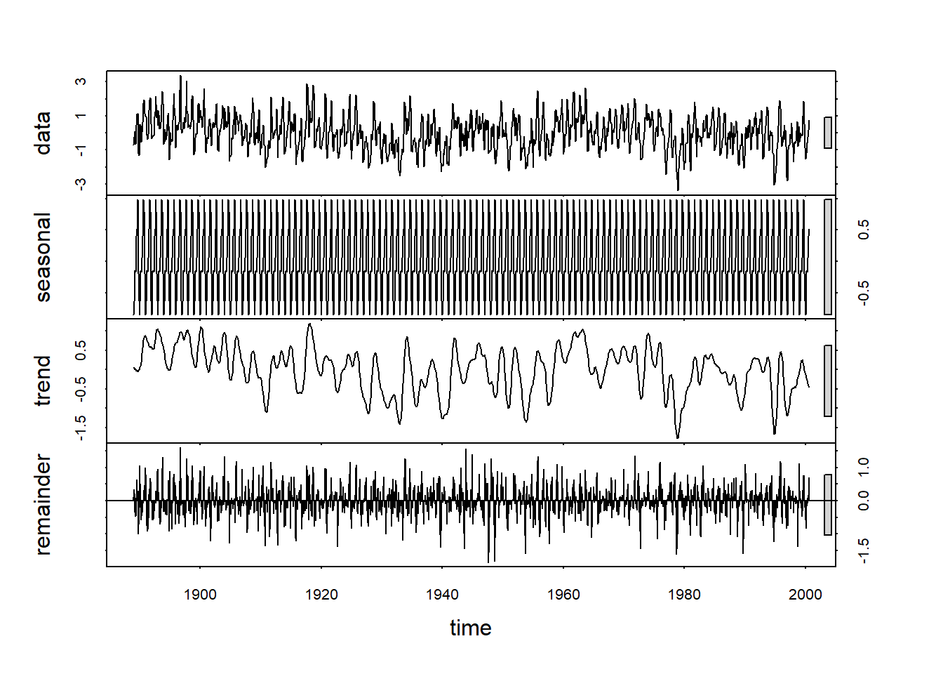
5.3.4.4 The trend
Now let’s apply spectral analysis to the trend component:
df6 <- df5 |>
  mutate(discharge = as.numeric(stl_res$time.series[,2]))


mtm3 <-   mtm(df6,output = 1,verbose = F,)  |>
  mutate(Period = 1/Frequency,
         Power = Power/1000, #account for differing units in astrochrons MTM
         AR1_95_power = AR1_95_power/1000) #account for differing units in astrochrons MTM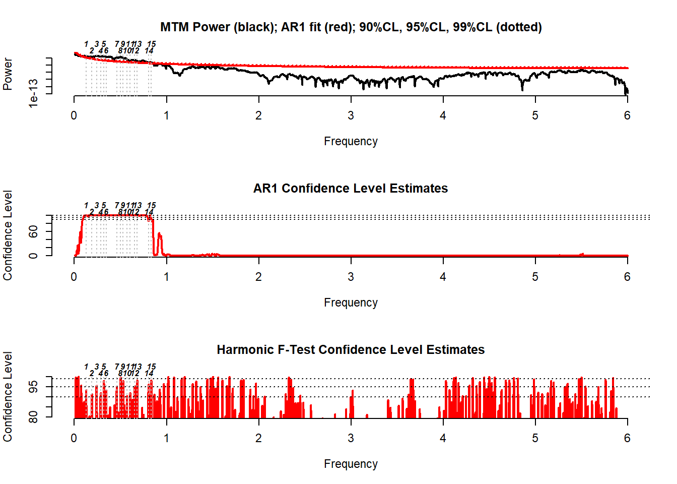
trendOnlySpectrum <- ggplot(mtm3, aes(x=Period, y=Power)) +
  labs(title = "Rio Grande discharge trend-only spectrum (mtm)") +
  geom_line() +
  geom_line(aes(y = AR1_95_power),color = "red") +
  scale_y_log10() +
  scale_x_continuous(trans = reverselog_trans(10),
                     breaks = c(100,50,20,10,5,2,1,0.5,0.2),
                     limits = c(100,0.2)) +
  theme_light()

trendOnlySpectrum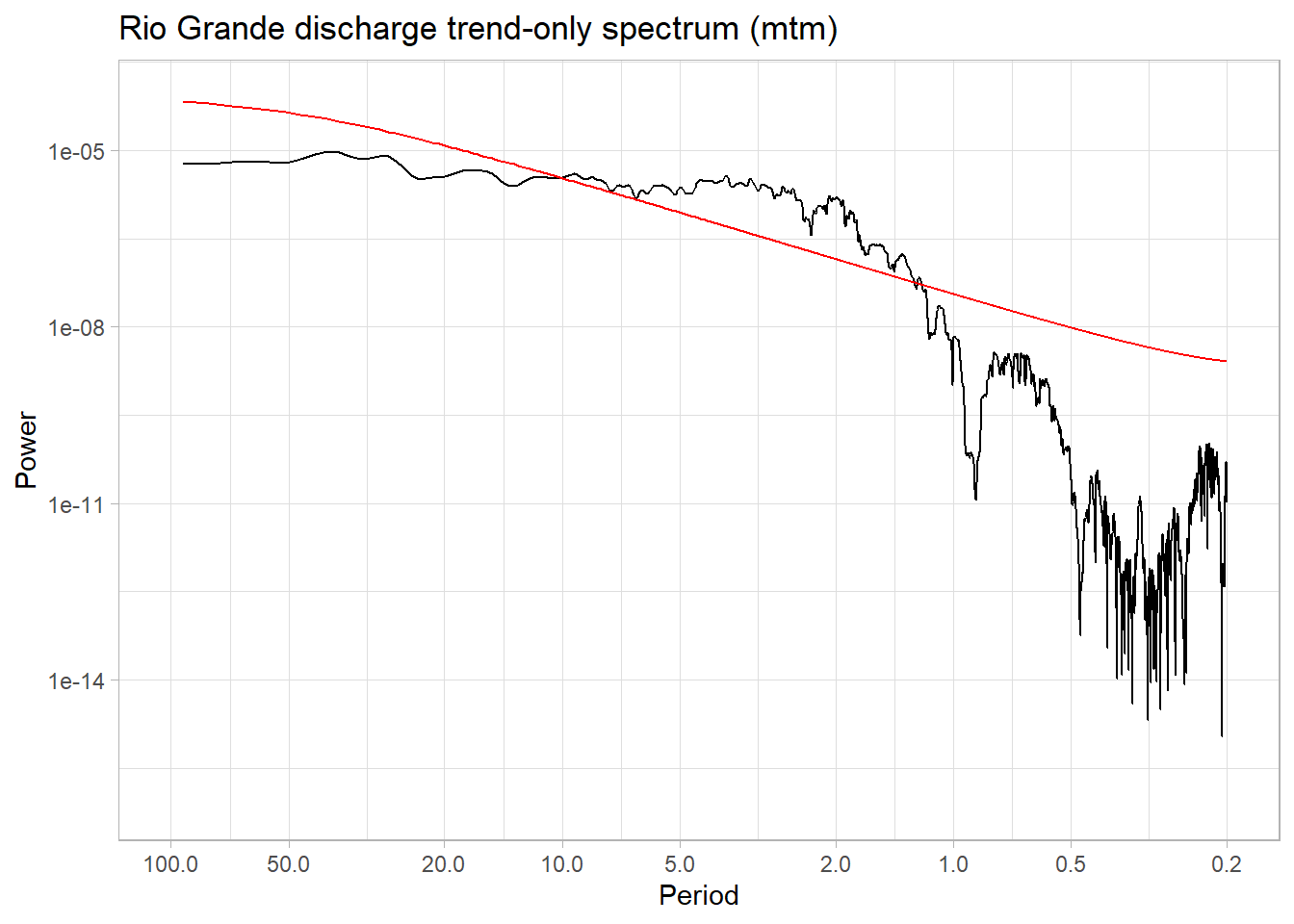
Indeed this removed the annual cycle and its harmonics (for the most part). It’s a fairly aggressive treatment, but we can now compare the significance of the interannual peaks w.r.t to an AR(1) benchmark.
We see that the broadband peak in the 2-10y range is above the AR(1) spectrum, so these frequencies could be considered significant.
5.3.5 Estimation of scaling behavior
In this last example, we fit a single scaling exponent to the timeseries, spanning the entire range of frequencies (periods). Under the hood, all we are doing is fitting a straight line to the spectrum:
# Log-transform both axes
toScale <- dplyr::filter(mtm3, between(Period,0.2,100))
log_period <- log10(toScale$Period)
log_spec <- log10(toScale$Power)

# Fit a line
fit <- lm(log_spec ~ log_period)
toScale$plotLine <- predict(fit)
# Plot

trendOnlySpectrum +
  geom_line(data = toScale,aes(x = Period,y = 10^plotLine),color = "blue",linetype = 3)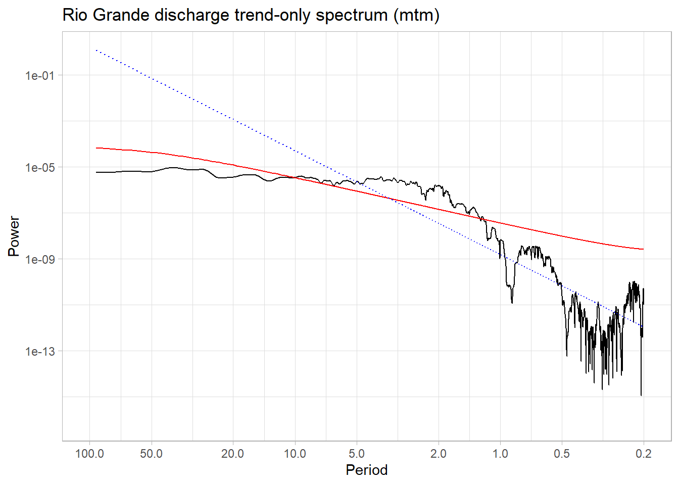
This results in a fairly steep exponent near 4.52. If we were specifically interested in the scaling exponent (spectral slope) between periods of 2-100y, you would do it like so:
# Log-transform both axes
toScale <- dplyr::filter(mtm3, between(Period,2,100))
log_period <- log10(toScale$Period)
log_spec <- log10(toScale$Power)

# Fit a line
fitLong <- lm(log_spec ~ log_period)
toScale$plotLine <- predict(fitLong)
# Plot

trendOnlySpectrum +
  geom_line(data = toScale,aes(x = Period,y = 10^plotLine),color = "blue",linetype = 3)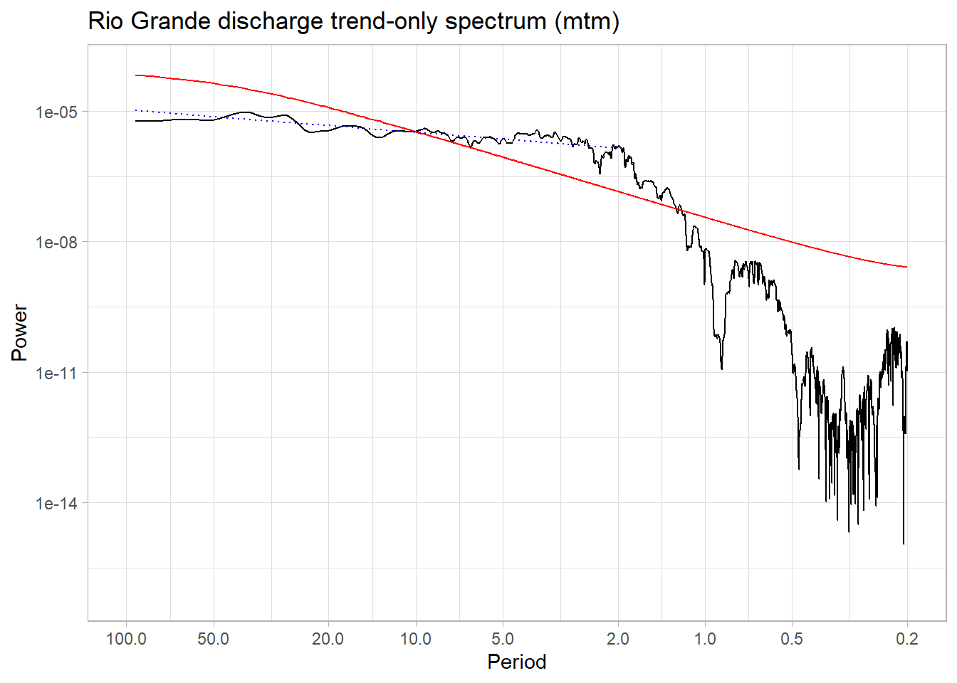
We see that this results in a much flatter line, i.e. a smaller scaling exponent around 0.52.